Case Study 01
Transforming Deskera HRM
Introduction
Deskera, a Singapore-based SAAS software provider, envisions revolutionising small businesses’ operations globally. As a Senior UX designer at Deskera in 2019, I was entrusted with the task of redesigning their HRM management solution, a crucial component of their all-in-one cloud-based application.
Industry
SaaS, Entreprise Software
Product Owner
Deskera 🇸🇬
Project Type
User Research, UI Revamp
Roles
Business Problem
Starting the Project
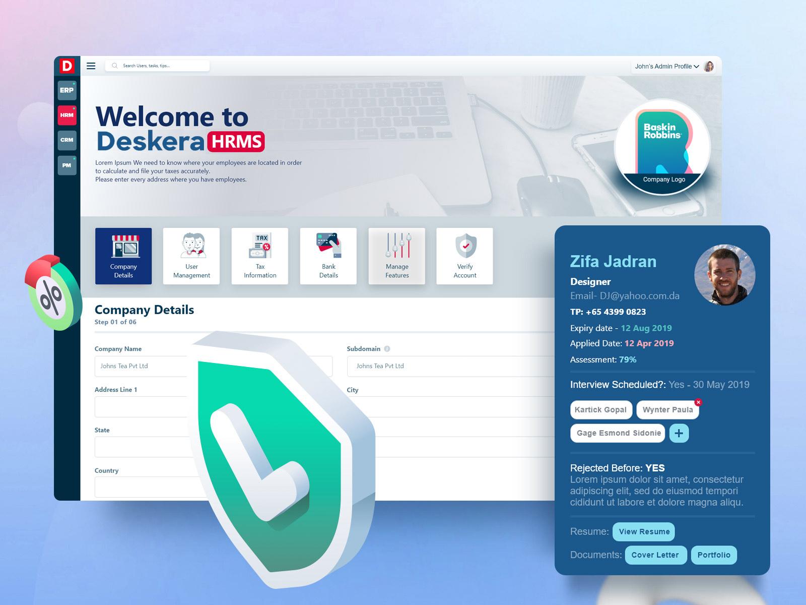
Upon joining Deskera as a Senior UX designer, I was presented with an exciting opportunity to redesign their HRM management solution. As a pivotal component of Deskera’s all-in-one cloud-based application, the HRM module played a crucial role in empowering small businesses worldwide. The existing application, although functional, faced significant challenges in terms of user experience (UX) and user interface (UI), leading to customer churn and hindered growth. As part of the design team, my mission was clear: to undertake a transformative UX redesign that would address these business problems and create a seamless, user-centric experience for Deskera’s clients.
Understanding the Business Problem
In my initial meetings with stakeholders, I delved into the heart of the business problem Deskera was facing. Customer churn was a matter of concern, with users expressing dissatisfaction with the existing HRM solution’s usability and interface. The UI was perceived as outdated, leading to a lack of trust and a disconnection with real-world users. These issues were further exacerbated by low user engagement and compatibility problems across various devices. Additionally, Deskera aimed to attract enterprise clients seeking advanced software services, necessitating the development of substantial new features for the application.
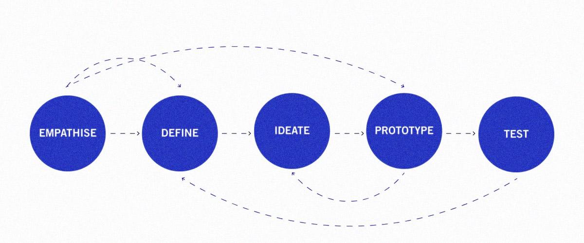
The UX Redesign Approach
UX Matrix
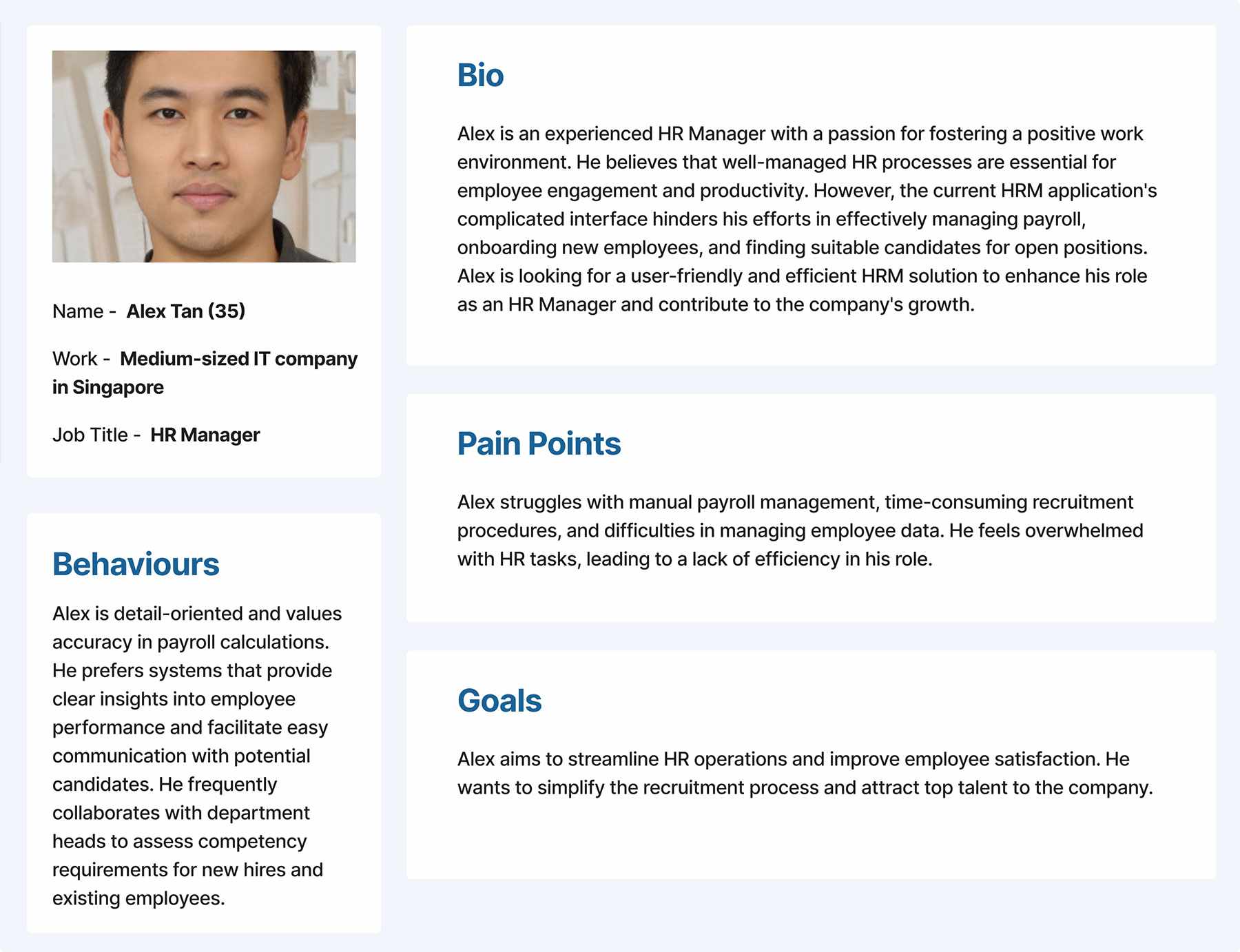
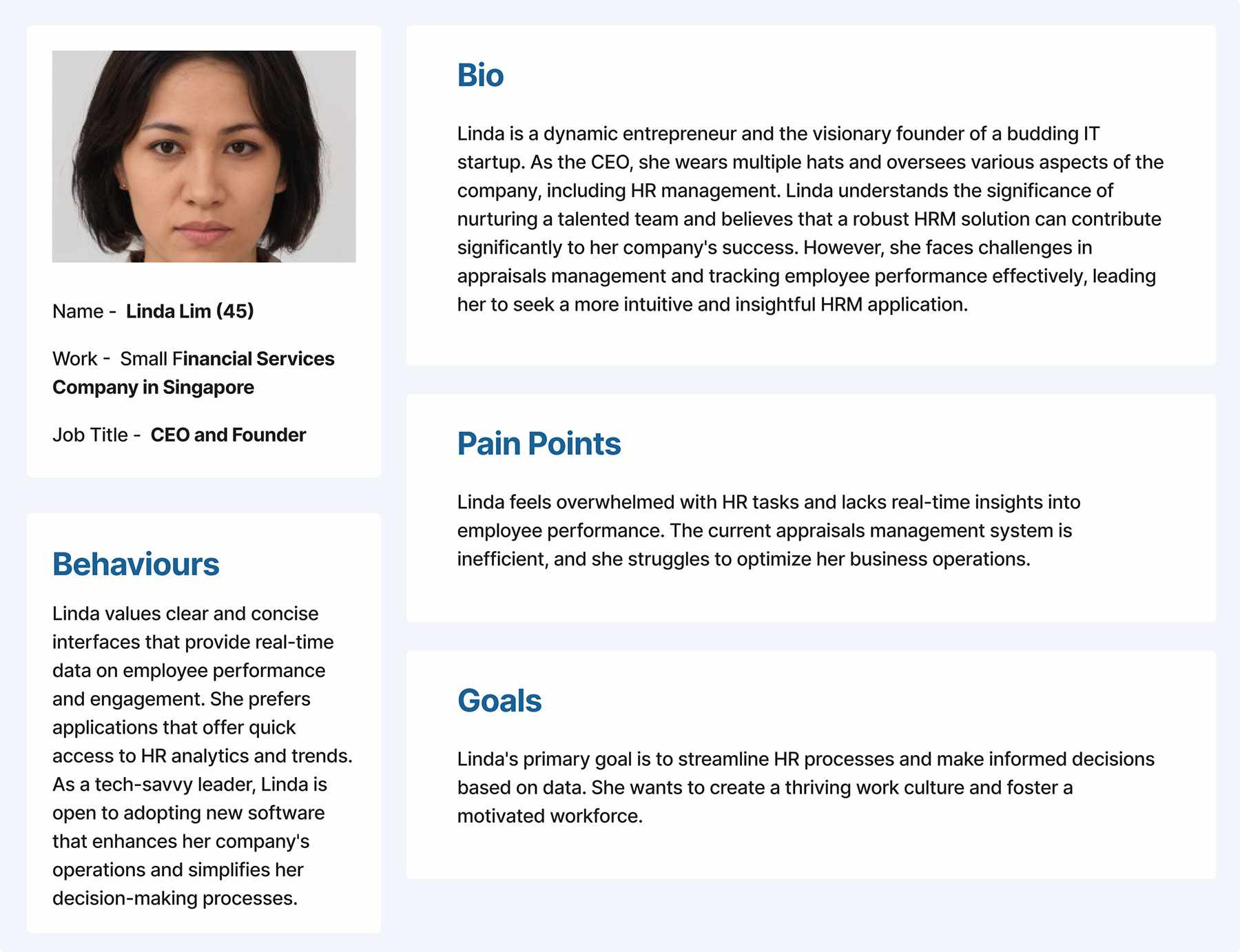
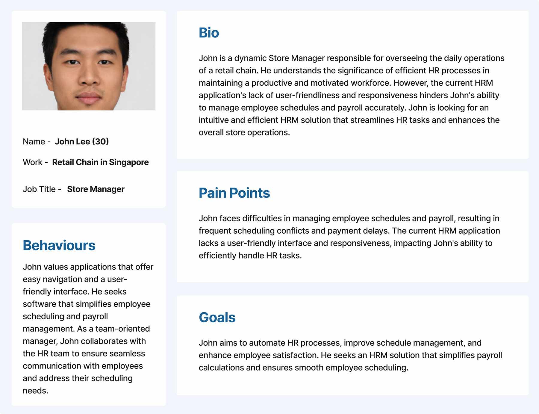
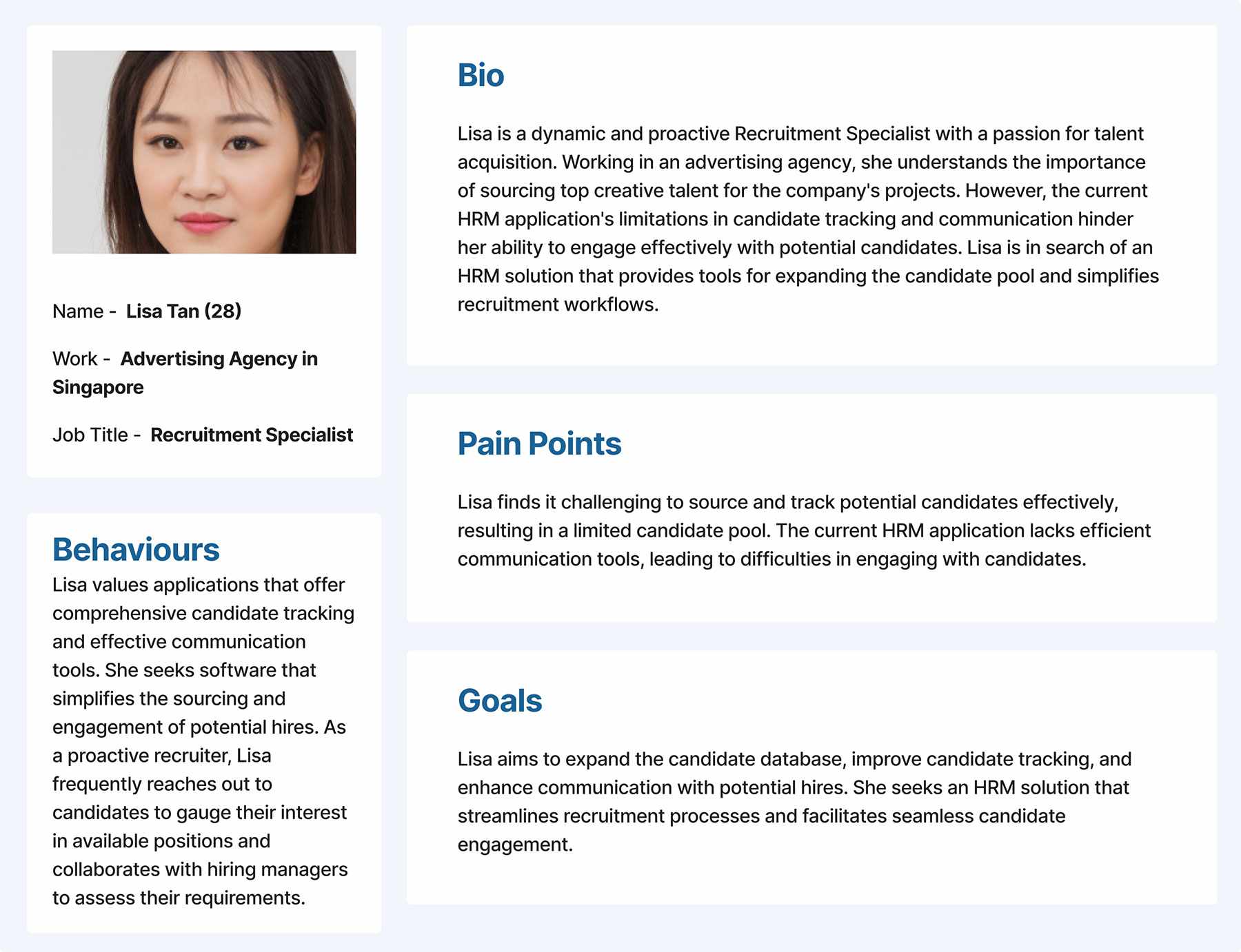
Next, I constructed a UX matrix that identified the key tasks, pain points, and goals of each user persona. This matrix served as a roadmap for the UX redesign, guiding us towards implementing solutions that would directly address user needs and pain points. By aligning our efforts with the UX matrix, we aimed to create an intuitive and efficient HRM solution that resonated with our target audience.
| Persona | Task | Difficulty (1-5) | Importance (1-5) | UI Related Issues | Proposed Solutions |
|---|---|---|---|---|---|
| Alex Tan | Payroll Management | 3 | 5 | Clumsy and Inconsistent Layout | Implement a clean and organized UI with intuitive data entry forms. |
| Employee Onboarding | 4 | 4 | Overwhelming Onboarding Process | Design a user-friendly onboarding journey with clear instructions. | |
| Recruitment Management | 4 | 4 | Confusing Application Navigation | Streamline recruitment workflows and introduce applicant tracking system. | |
| Linda Lim | Appraisals Management | 3 | 5 | Inefficient Appraisals Interface | Develop an easy-to-use performance appraisal module with clear feedback. |
| Real-time Employee Insights | 4 | 5 | Lack of Real-time Data Visualization | Integrate real-time data analytics and dashboards for better insights. | |
| John Lee | Unified Experience across Devices | 4 | 5 | Inconsistent UI across Different Devices | Implement responsive design to ensure a consistent experience. |
| Integration with Other Applications | 3 | 4 | Difficulty in Integrating with Third-party Apps | Facilitate easy integration with popular third-party applications. | |
| Lisa Tan | Candidate Tracking and Communication | 3 | 5 | Tedious Candidate Tracking Process | Develop an organized candidate tracking system with effective communication tools. |
| Expanding Candidate Database | 4 | 4 | Limited Candidate Database | Implement tools to source and expand the candidate pool. | |
| Michael Goh | Payroll Management | 3 | 5 | Complex Payroll Processing | Optimize payroll processing and ensure accurate calculations. |
| Appraisals and Competencies Tracking | 4 | 4 | Difficulty in Tracking Employee Competencies | Introduce a competency tracking system and simplify appraisal processes. |
Improvements of Application Screens
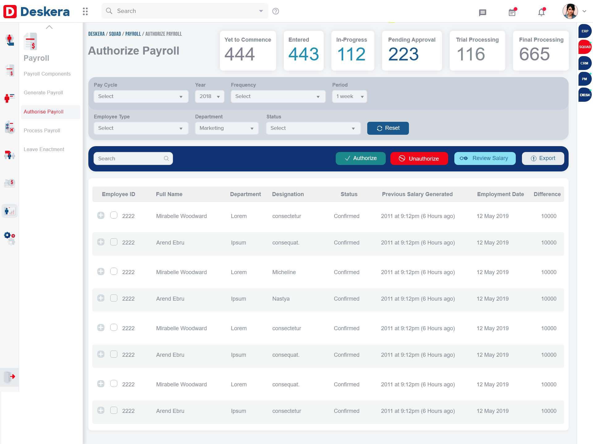
Payroll Management
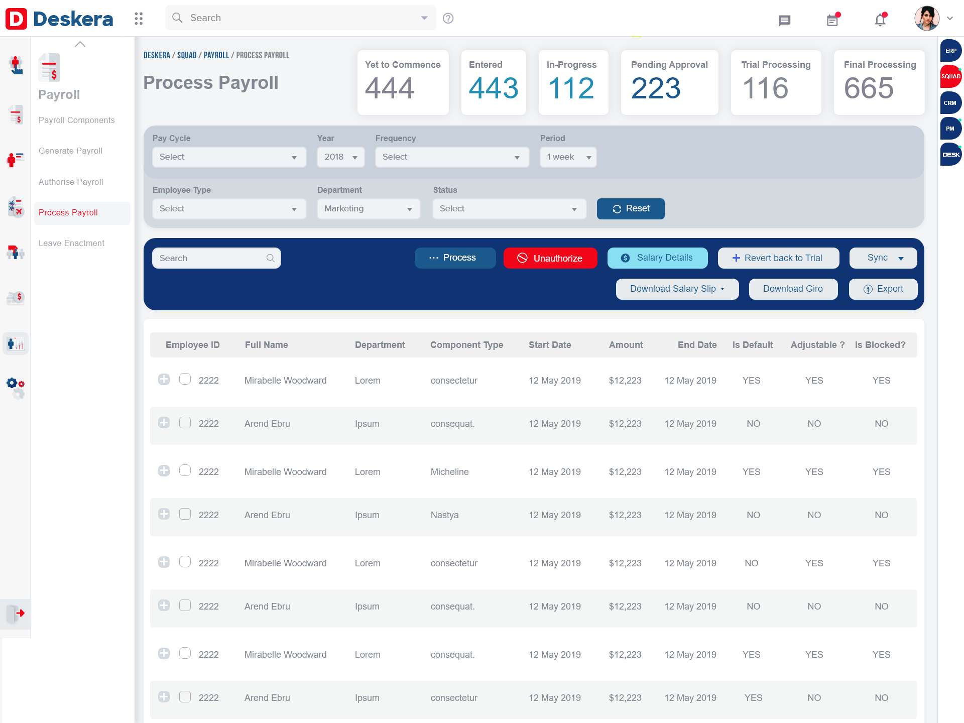
Employee Onboarding
- The revamped Employee Onboarding process now guided new hires through a step-by-step journey, making the process intuitive and less overwhelming.
- A dashboard provided Linda with an overview of the onboarding progress, allowing her to track and manage multiple new hires simultaneously.
- Clear instructions and tooltips provided necessary information and helped Linda Lim’s new employees quickly adapt to their roles.
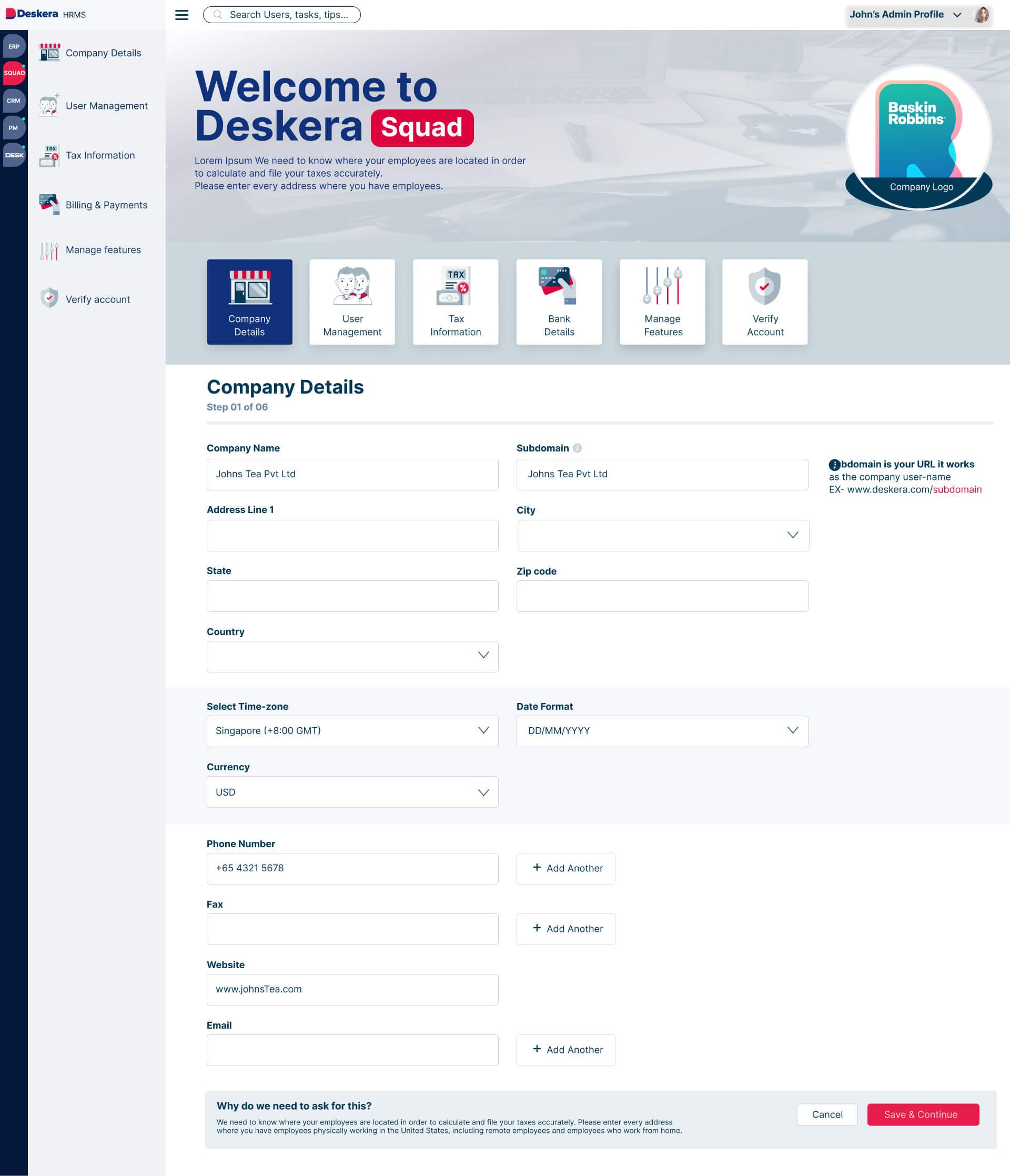
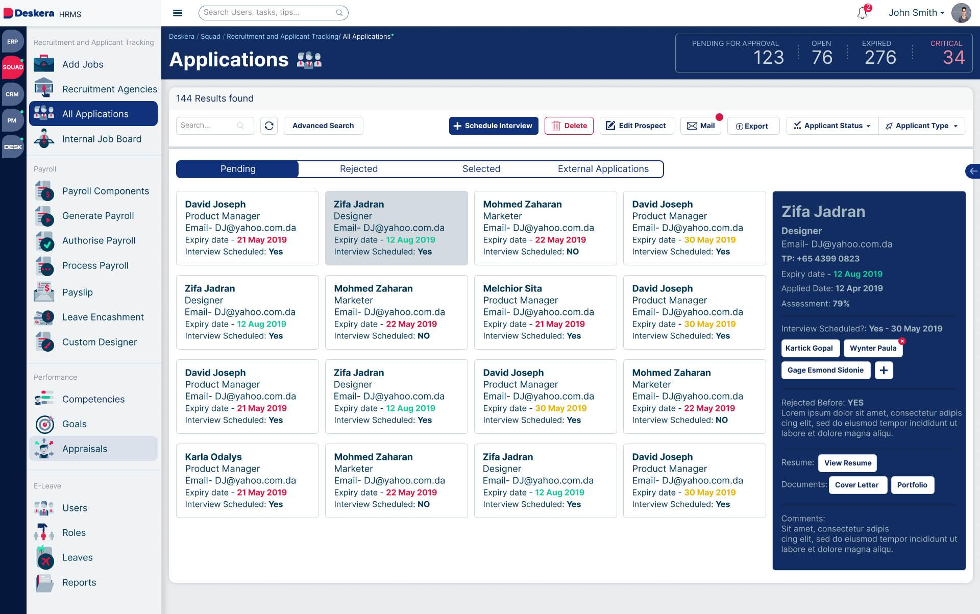
Recruitment Management
- Streamlined recruitment workflows and an applicant tracking system enabled Alex Tan to efficiently manage job postings, applications, and candidate interactions.
- Advanced filtering and search options helped Alex find the best candidates from the expanded talent pool, as suggested by Lisa Tan’s proposed solution.
- Real-time notifications and scheduling features facilitated seamless communication between recruiters and candidates.
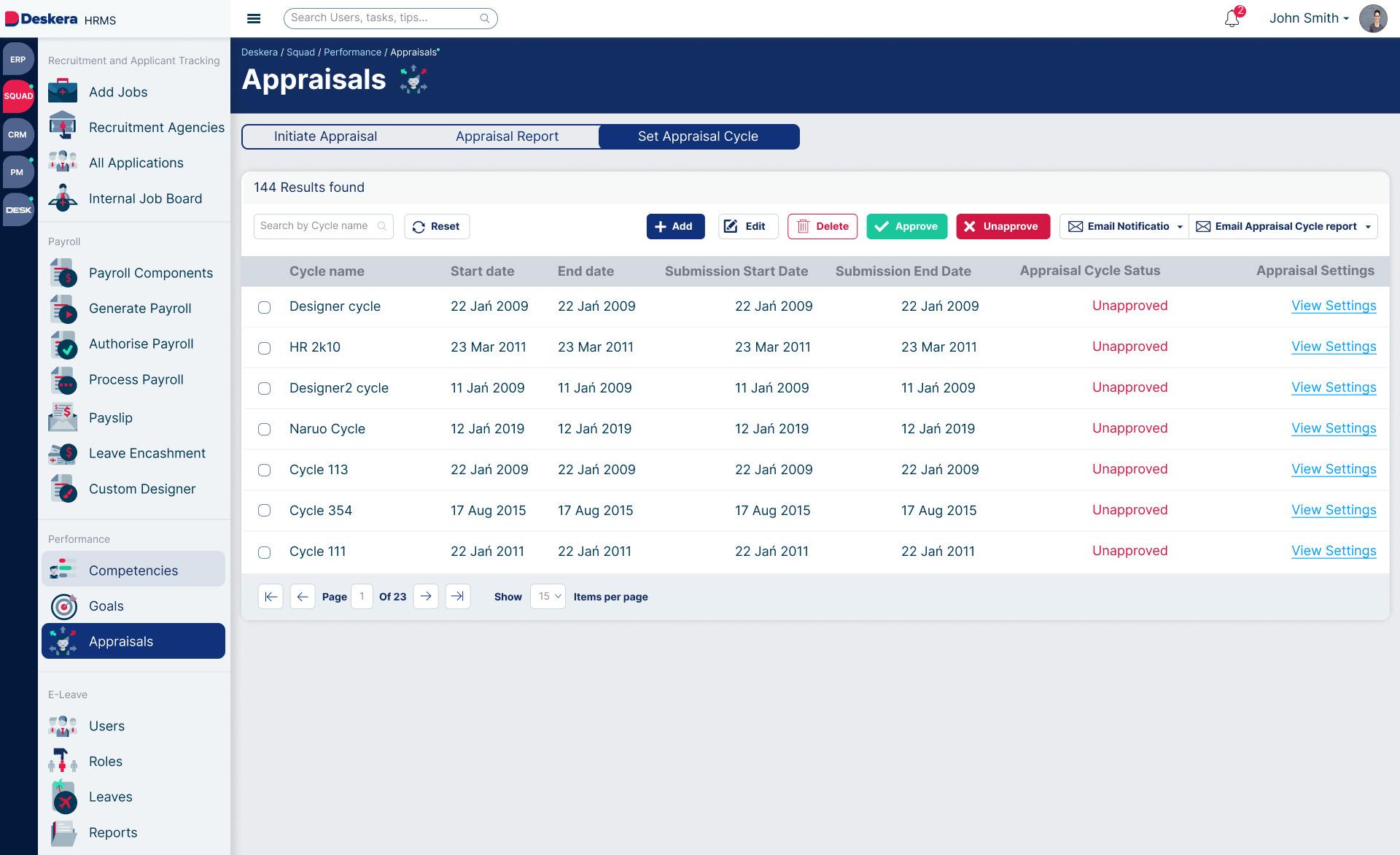
Appraisals Management
- The redesigned Appraisals Management module offered an intuitive interface, simplifying the process for both managers and employees.
- The 360-degree feedback system provided by the performance appraisal module, as per Linda Lim’s goal, allowed employees to receive constructive feedback from peers and superiors.
- User-friendly interfaces for setting goals and tracking performance ensured efficient appraisal processes and fostered a culture of continuous improvement.
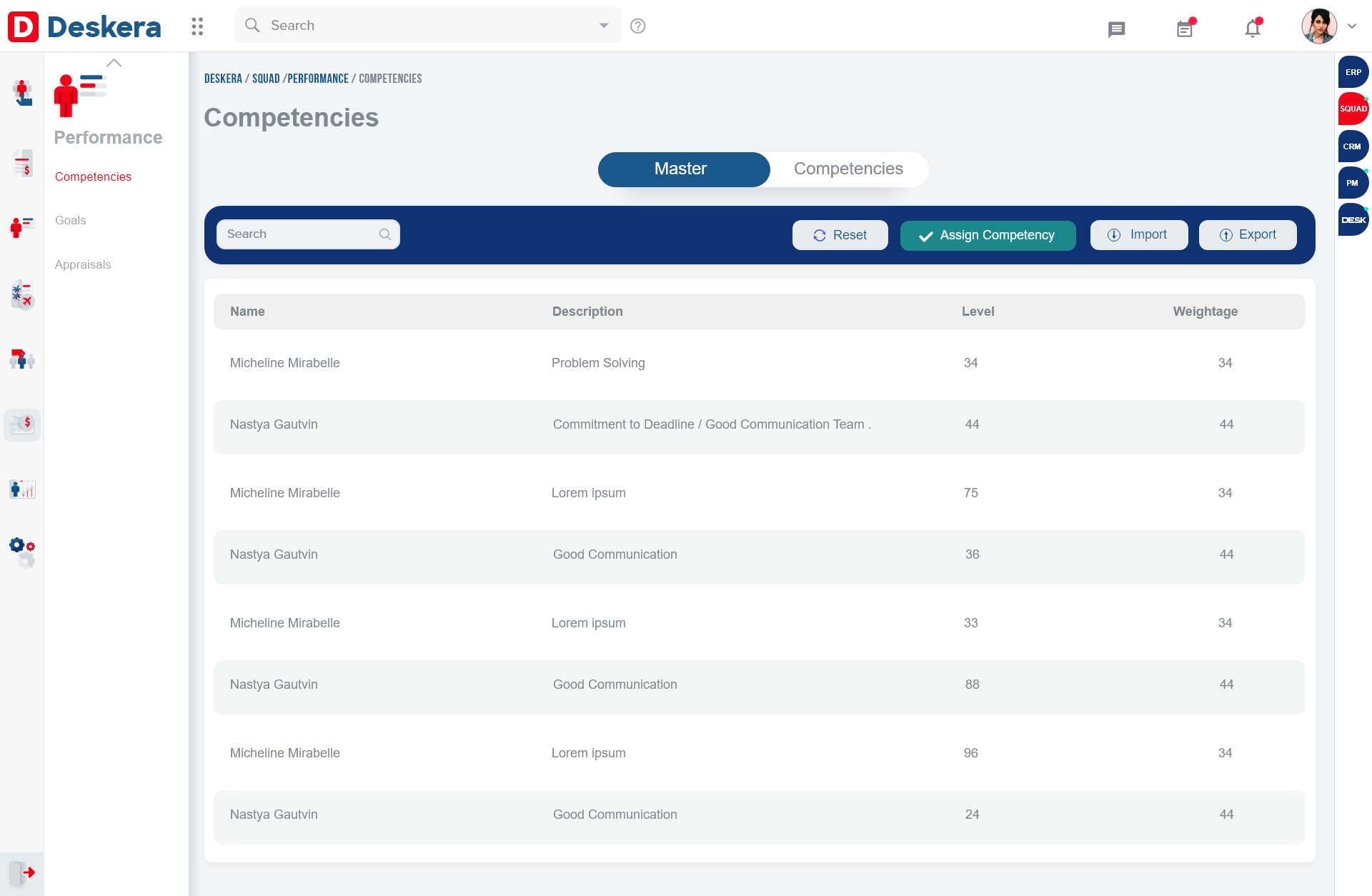
Competencies Tracking
- As proposed in the UX matrix, a competency tracking system was introduced, enabling Michael Goh to assess employee skills and capabilities.
- Visual representations of competency levels provided an easy-to-understand overview of employees’ strengths and areas for improvement.
- Integration with Appraisals Management allowed for seamless alignment of competencies with performance evaluations.
Creating a Cohesive UI Element and Icon Library
UI Element Library
To ensure a cohesive and harmonious design across all application screens, we meticulously crafted a UI element library that included various button styles and a touch of Neumorphism. Neumorphism, also known as Soft UI, is a modern design trend that combines elements of skeuomorphism and flat design, resulting in buttons and components with subtle shadows and highlights, mimicking the effect of real-world materials.
Button Styles
- Primary Button: A prominent button style with a subtle Neumorphism effect, indicating important actions such as “Save,” “Submit,” or “Create.” Its vibrant color scheme and shadow effect drew users’ attention to the primary call-to-action.
- Secondary Button: This style represented secondary actions, such as “Cancel” or “Back.” It featured a lighter color palette and a softer shadow effect, maintaining visual consistency with the primary button.
- Text Button: A subtle button style with no background color, presenting actions as a simple, underlined text link. This style was used for non-primary actions to avoid overwhelming users with too many visually dominant buttons.
Icon Library
Testing and Launch
- Usability Testing: Representative users from each persona were invited to navigate the redesigned application and perform common tasks. Feedback was collected to identify any remaining usability issues.
- Compatibility Testing: The application was tested across various devices, browsers, and operating systems to ensure compatibility and responsiveness.
- Performance Testing: The application’s performance was assessed under various load conditions to ensure it could handle multiple users seamlessly.
- Security Testing: Stringent security tests were conducted to safeguard sensitive data and protect the application from potential threats.
Launch and Results
- Improved User Satisfaction: User feedback indicated a significant increase in satisfaction with the new UI and UX. Positive comments revolved around the ease of use, clarity of instructions, and enhanced overall experience.
- Reduced Customer Churn: With the implementation of intuitive interfaces and efficient workflows, customer churn was reduced substantially. Clients appreciated the seamless navigation and enhanced features.
- Increased User Engagement: The redesigned application saw a notable increase in user engagement. Tasks that were previously tedious and time-consuming were now completed more efficiently.
- Expanded Customer Base: The revamped application successfully attracted new clients in new markets. The modernized UI and user-friendly experience appealed to a broader audience.
- Positive Business Outcomes: The combination of improved user experience and customer satisfaction led to positive business outcomes for Deskera. The company experienced increased revenue and strengthened its position in the market.
