How Learning Point’s Website Redesign Boosted Traffic, Conversions & SEO
Introduction
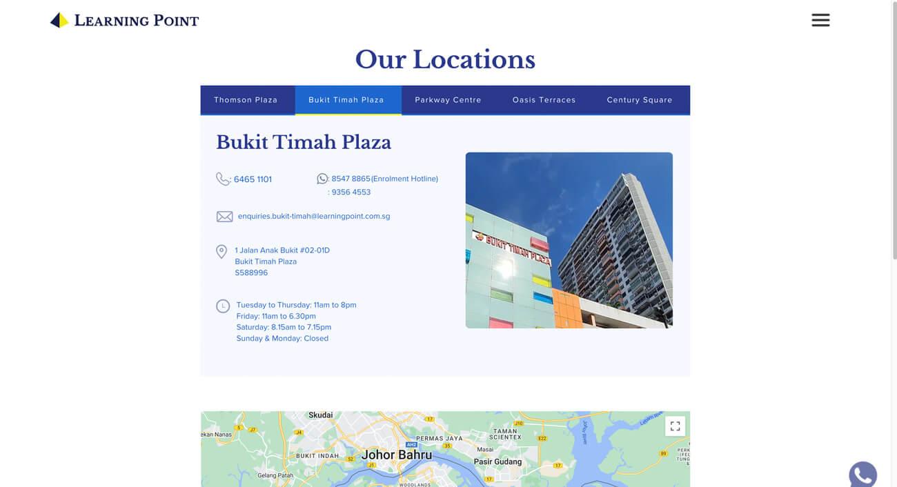
Learning Point, a leading education provider, sought to modernize its website to align with the evolving digital landscape. The primary challenge was to enhance the visual appeal, usability, and structure of the site while maintaining brand consistency with its other digital assets, such as the previously redesigned Curos.sg website.
Upsense™ Studio, a Singapore-based award-winning digital design agency, required a complete website and brand identity overhaul to position itself as a top-tier design studio. The primary goals were to create a modern, engaging digital presence, improve user experience, and introduce a subscription-based design model for businesses. The new website needed to stand out in a competitive industry, clearly communicate services, and drive conversions through a well-structured, intuitive design.
Learning Point, a leading education provider, sought to modernize its website to align with the evolving digital landscape. The primary challenge was to enhance the visual appeal, usability, and structure of the site while maintaining brand consistency with its other digital assets, such as the previously redesigned Curos.sg website. The project faced several key constraints:
Platform Limitations
The website was built on Wix, which restricted certain design customizations and functionalities.
Design Consistency
The new site had to seamlessly integrate with Learning Point’s existing brand identity.
User Experience & Navigation
The previous design lacked intuitive navigation and clarity, leading to difficulties in content discovery.
Scalability
The new website needed a modular and expandable design system to accommodate future updates and content growth.
To address these challenges, the team developed a comprehensive design system that streamlined the visual identity, user experience, and functionality of Learning Point’s website. This solution focused on:
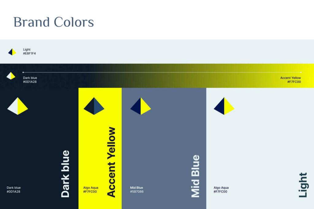
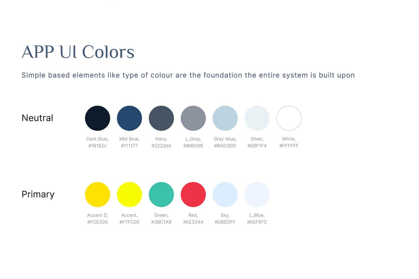
Color Simplification – The new color palette ensured a professional yet engaging look
(#E8F1F4) – Used for background elements and sections to create a clean layout.
Dark Blue (#0D1A28) – Applied for typography and key UI elements for contrast and readability.
Accent Yellow (#F7FC00) – Strategically incorporated to highlight CTAs, buttons, and interactive elements.
Complementary Colors – Used to enhance visual harmony across different sections.
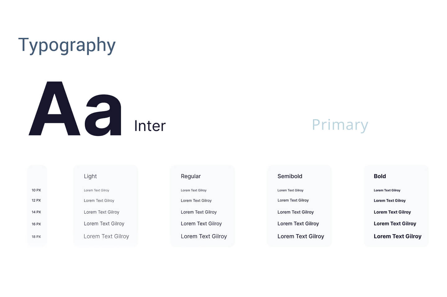
Typography Standardization – The selection of fonts was guided by readability, modern aesthetics, and consistency across digital platforms:
Inter – A sans-serif font known for clarity and legibility in digital interfaces.
Gilroy – A modern geometric sans-serif font that adds a contemporary feel to branding elements.
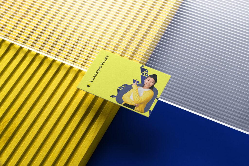
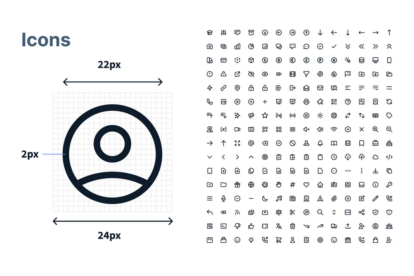
Comprehensive Icon Library – To ensure a visually engaging experience, a custom icon set was developed to represent Learning Point’s EdTech offerings, simplifying information delivery and enhancing user interactions.
The Approach
The design process was structured around three core phases:
1. Establishing a Scalable Design System
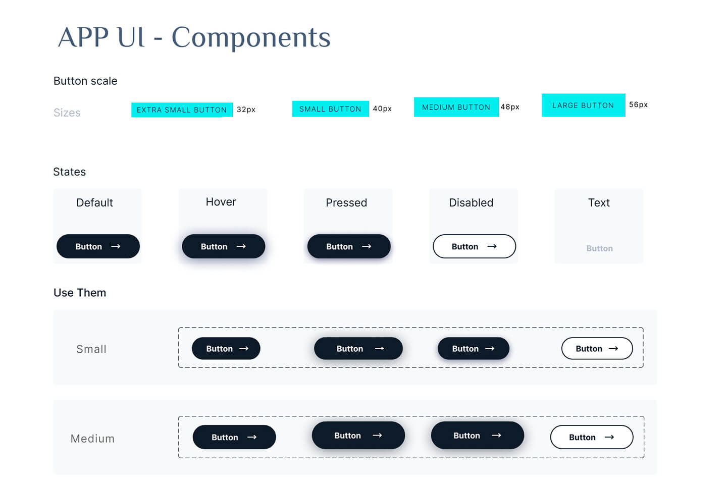
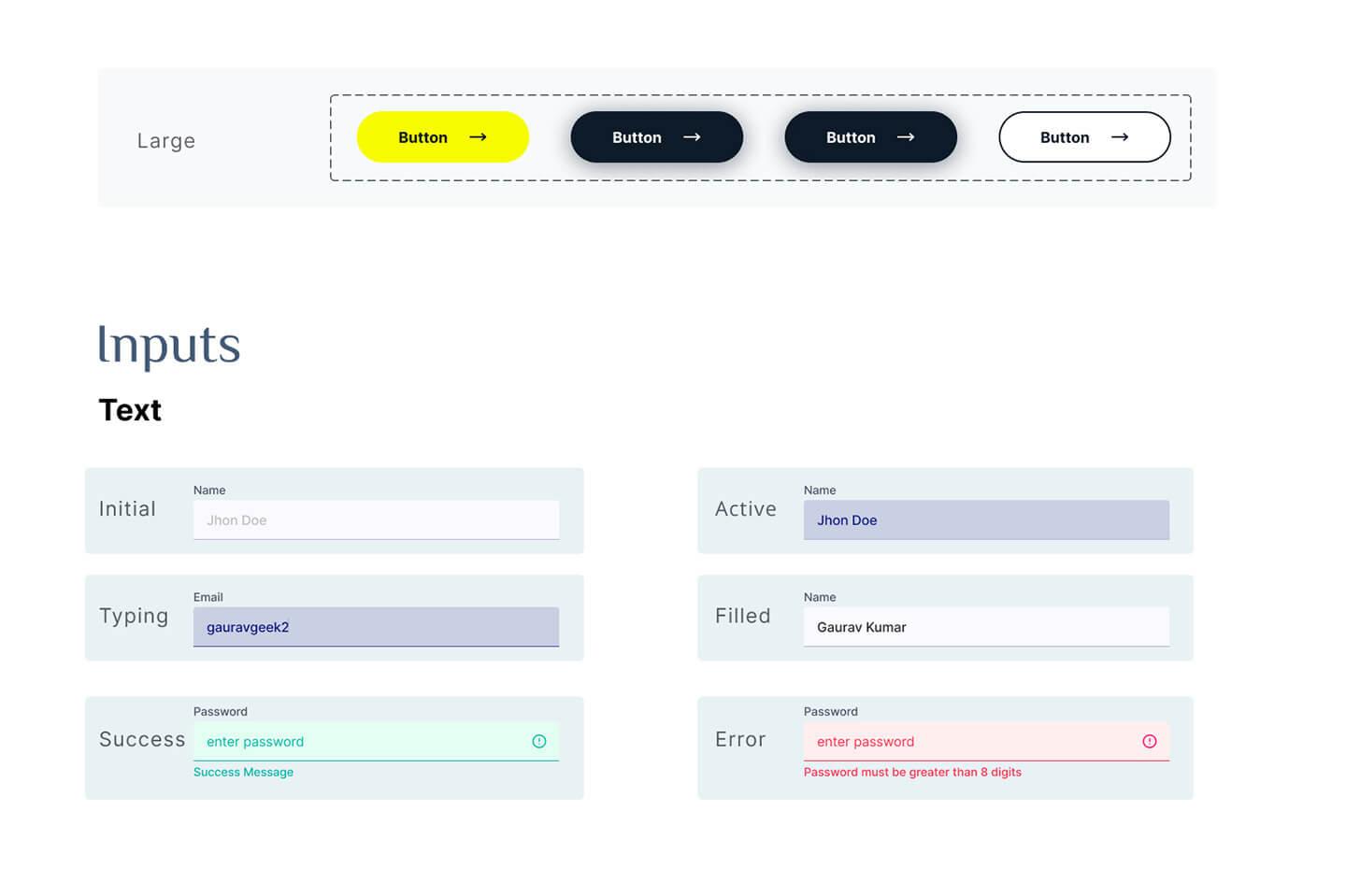
A detailed design system was created to ensure consistency and scalability. It documented essential design elements, including:
Brand colors with specific usage guidelines.
Typography styles for headings, body text, and callouts.
Iconography standards with a unified visual style.
UI components and states (buttons, forms, interactive elements).
2. Enhancing User Experience & Accessibility
A user-centric approach was adopted to refine navigation, layout structure, and readability:
Clear content hierarchy – Sections were restructured for better information flow.
Intuitive navigation – The sitemap was redesigned to ensure users could quickly find relevant content.
Accessible design – WCAG guidelines were followed to improve text contrast, button visibility, and responsive scaling.
3. Adapting to Wix Constraints with Strategic Design Choices
Since the platform had predefined layout limitations, strategic design solutions were implemented:
Optimized templates – Selecting and modifying Wix’s most flexible layouts to align with brand needs.
Custom CSS adjustments – Applied where possible to enhance design flexibility.
Performance improvements – Reduced visual clutter, ensuring fast loading times and smooth interactions.
Before vs. After: Website Transformation
To showcase the impact of the redesign, a before-and-after comparison highlights the major improvements:
Enhanced Navigation & Content Flow
Improved menu structure and clear content sections allow users to find information quickly.
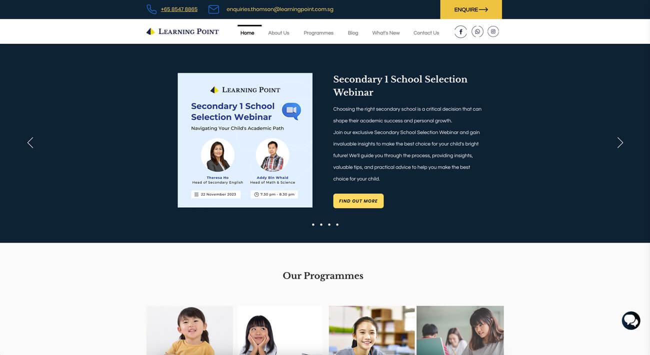
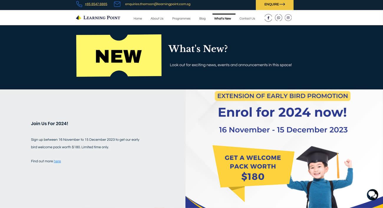
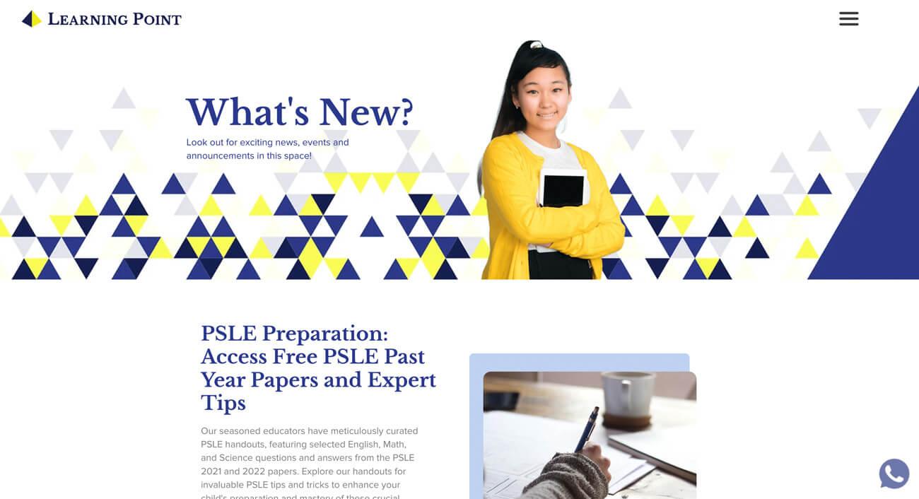
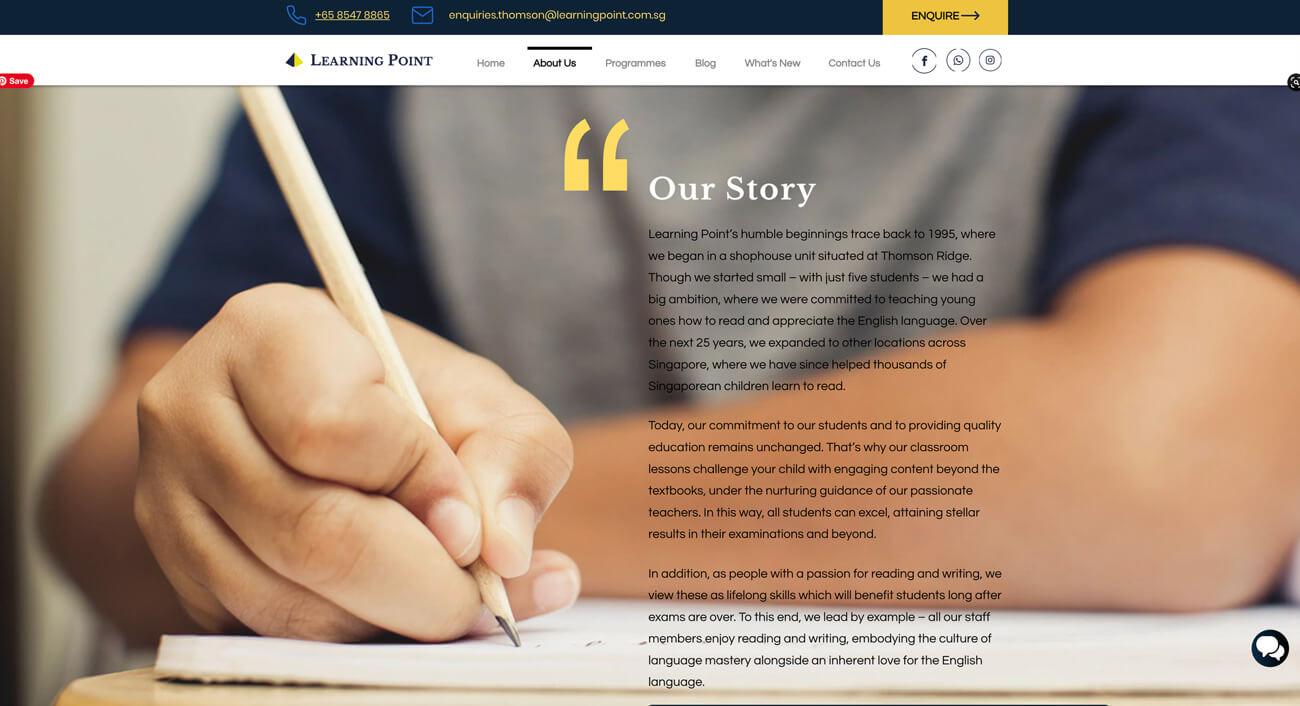
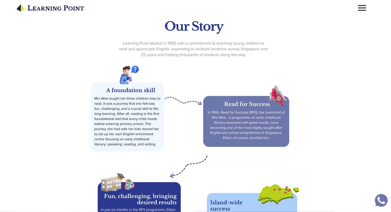
Before
After
Modern UI Design
The refreshed layout incorporates better spacing, visuals, and structured content blocks for a seamless reading experience.
Before
After
Improved Readability & Typography
Text is now more legible, with a balanced font hierarchy improving clarity.
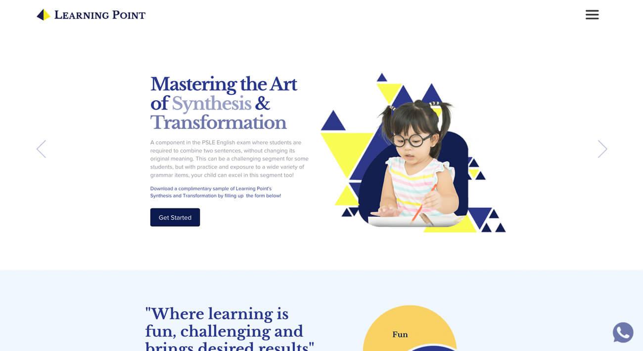
Before
After
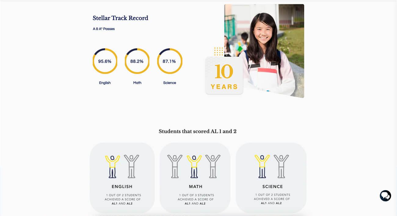
Before
After
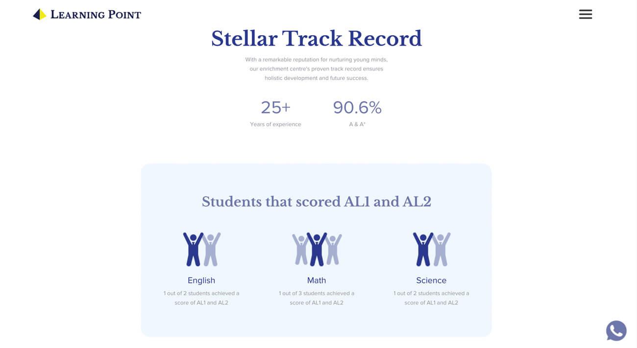
Stronger Visual Identity
The revised color scheme and iconography make Learning Point’s digital presence more engaging and professional.
Before
After
Outcome & Measurable Impact
The redesigned website has led to significant improvements across key performance metrics:
Traffic & Visitors
Unique Monthly Visitors: Increased by ~40–50%, from ~1,000 to 1,400+ per month.
Total Page Views: Doubled from ~1.5K to 3K–4K page views per month (~150%+ increase).
Bounce Rate: Improved from 60–61% down to 49%, an ~18% relative drop.
User Engagement
Average Session Duration: Increased by ~200%, from 1 min 23 sec to 4 min 6 sec.
Pages per Visit: Grew from 1.5 pages/session to 2.7 pages/session (~80% increase).
Click-Through & Interaction: Higher engagement levels, with users interacting more with menus and CTAs.
SEO Performance
Domain Authority (DA): Improved by 30–40%, strengthening credibility.
Keyword Rankings: Now ranking for hundreds of relevant search queries.
Organic Traffic: Google-driven traffic now accounts for 41% of total visits, a ~66%+ growth.
Conversions & Lead Generation
Inquiry Form Submissions: Increased by ~30–40%.
Newsletter Sign-Ups: Up ~20% due to better visibility.
Demo & Trial Class Requests: Increased by ~25–30%.
Overall Conversion Rate: Higher conversion percentages across inquiry, sign-ups, and demo bookings.
Conclusion
The Learning Point website revamp successfully overcame technical constraints and introduced a scalable, user-friendly digital experience. By implementing a well-structured design system, the project established a consistent brand identity, improved usability, and enhanced engagement.