Sandy Galabada

Sandy Galabada

Product Designer

Case Study 04

Qitt- A Social Q&A Platform

Empowering Social Connections through Verified Q&A Insights

Introduction

Qitt is a user-driven Q&A platform where you can seek verified answers from professionals, engage in meaningful discussions, and earn income. Join now for accurate insights and vibrant conversations

Industry

Social Q&A Platform

Client

Algomerchant πŸ‡ΈπŸ‡¬Β Β 

Project Type

User Research, Product Design, UX

Roles

Researcher, Designer

Tools

Project Overview

Project Overview Qitt is a mobile app created by Algomerchant Pvt Ltd, a Singapore-based IT firm known for AI-based stock market software services. Qitt, in collaboration with Synapzter, aims to build an interactive Q&A platform that allows users to ask, answer, and earn. This one-of-a-kind app encourages users to share their knowledge and fosters social connections. Qitt distinguishes itself from traditional Q&A apps by providing verified professional insights, ensuring credible and accurate information.
I led the design thinking process for Qitt as the User Experience Designer at Algomerchant. Extensive user research, defining pain points and goals, and creating user-friendly wireframes and prototypes were all critical components of creating an engaging app. Qitt is positioned as a premium platform, redefining the market’s Q&A experience, thanks to the collaborative efforts of the CTO, mobile app developers, and marketing manager.

Design Thinking Process

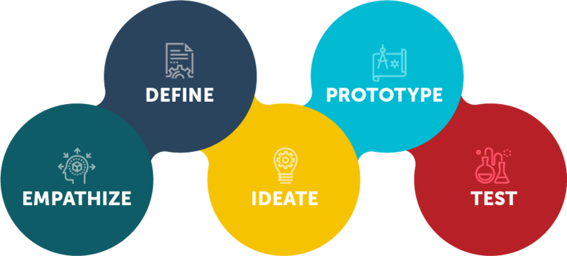
The design thinking process was chosen as a strategic decision to ensure Qitt’s success in a competitive market. This approach centered on understanding users’ needs and pain points, then refining features based on iterative feedback to produce a satisfying and engaging user experience. The parallel project with Algomerchant initiatives allowed for thorough research, ideation, and testing to create a well-crafted and innovative Q&A platform. Collaboration with Synamzter, as well as close collaboration among the CTO, app developers, and marketing manager, helped Qitt establish itself as a premium platform, distinguishing itself in the Q&A market and fostering meaningful connections among users.

Stage 1: Empathise

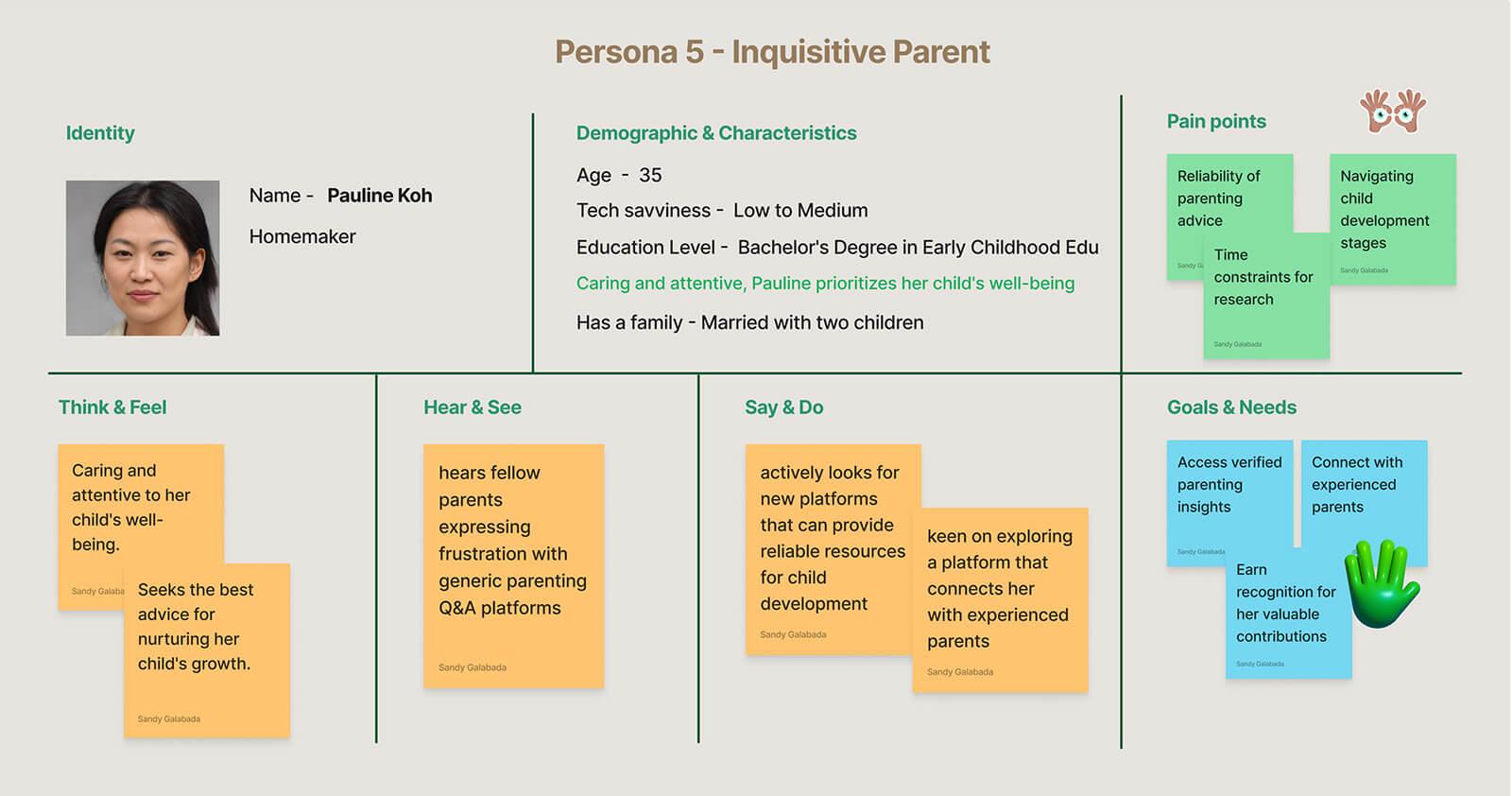
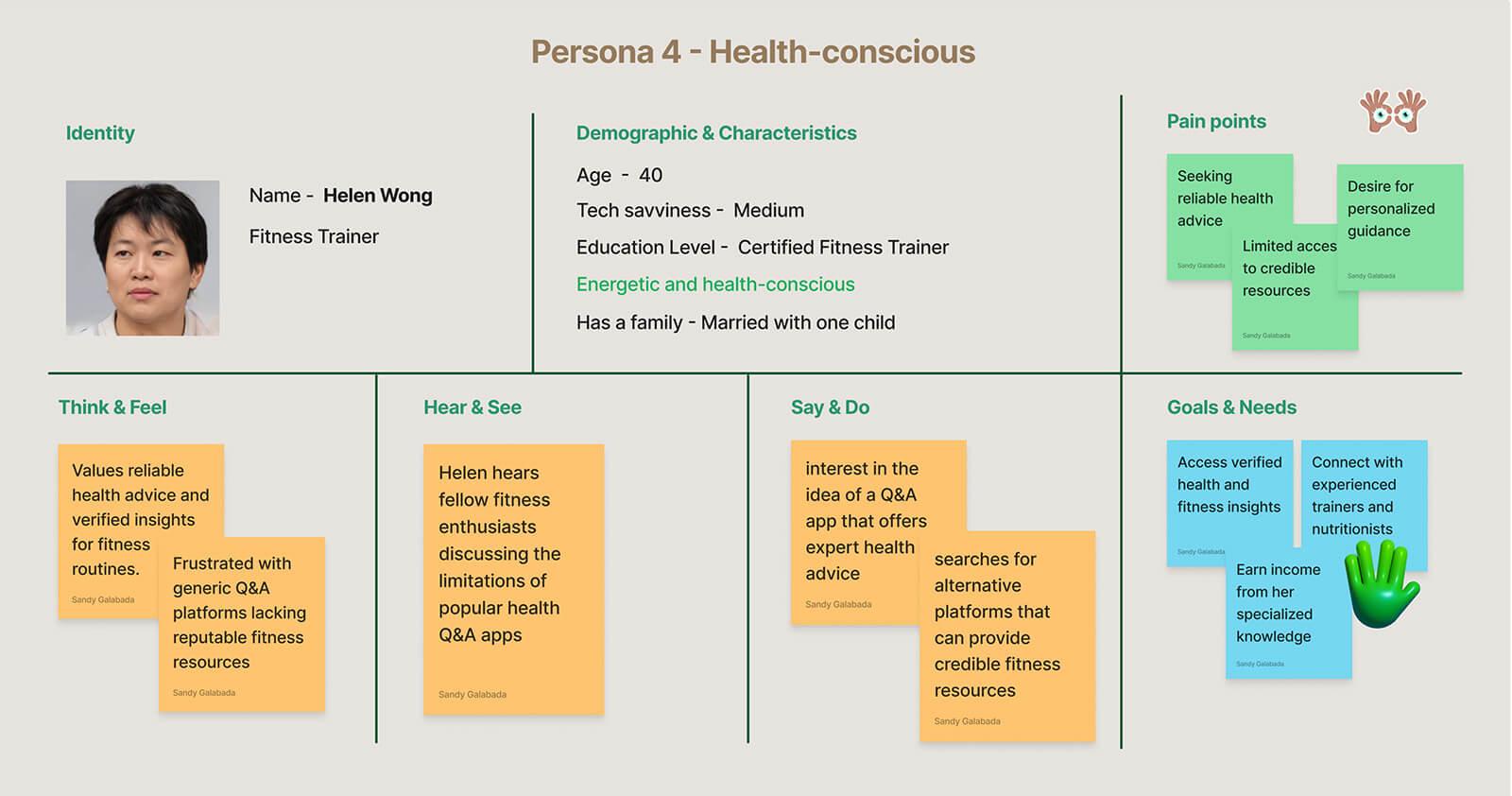
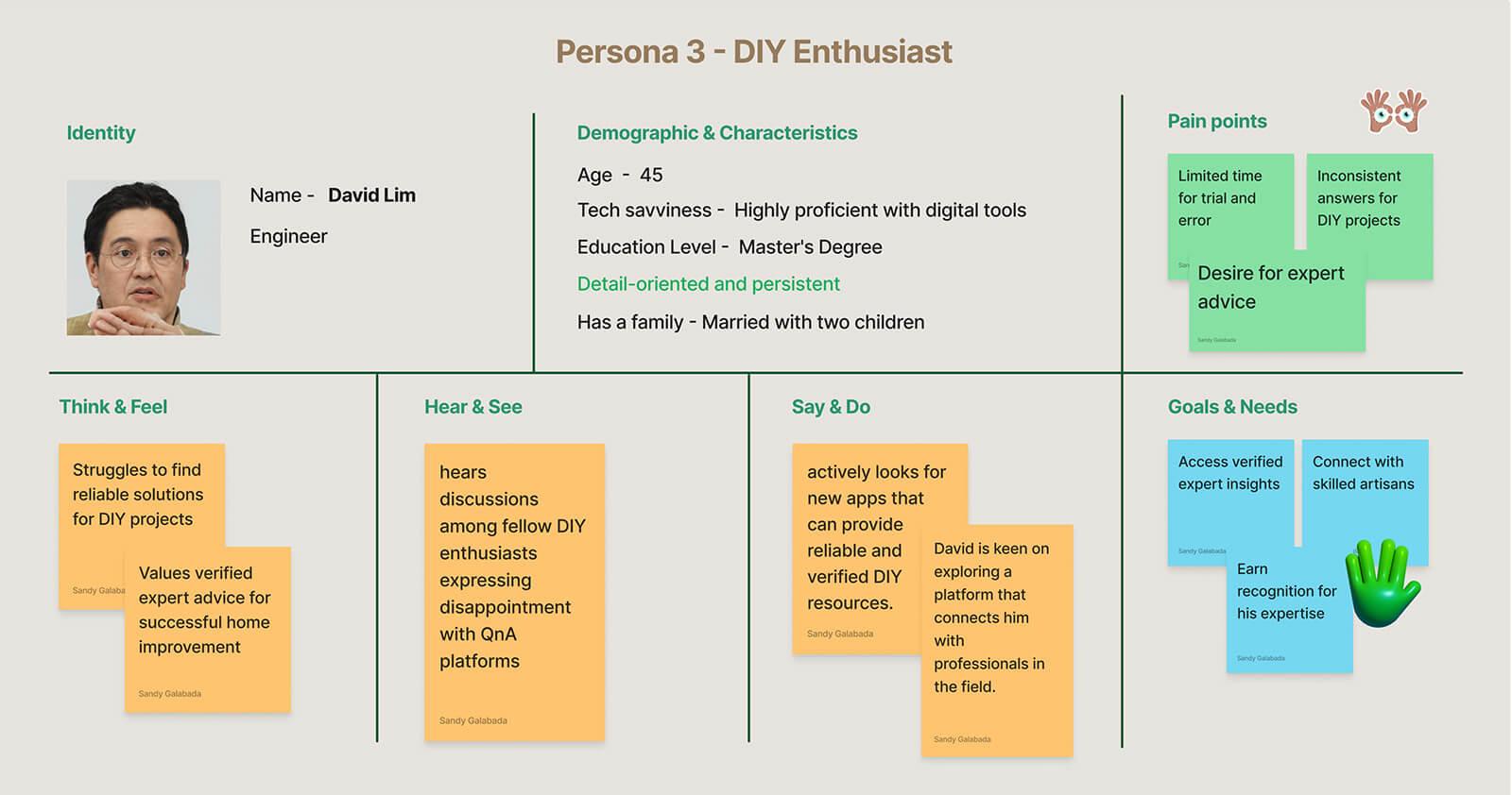
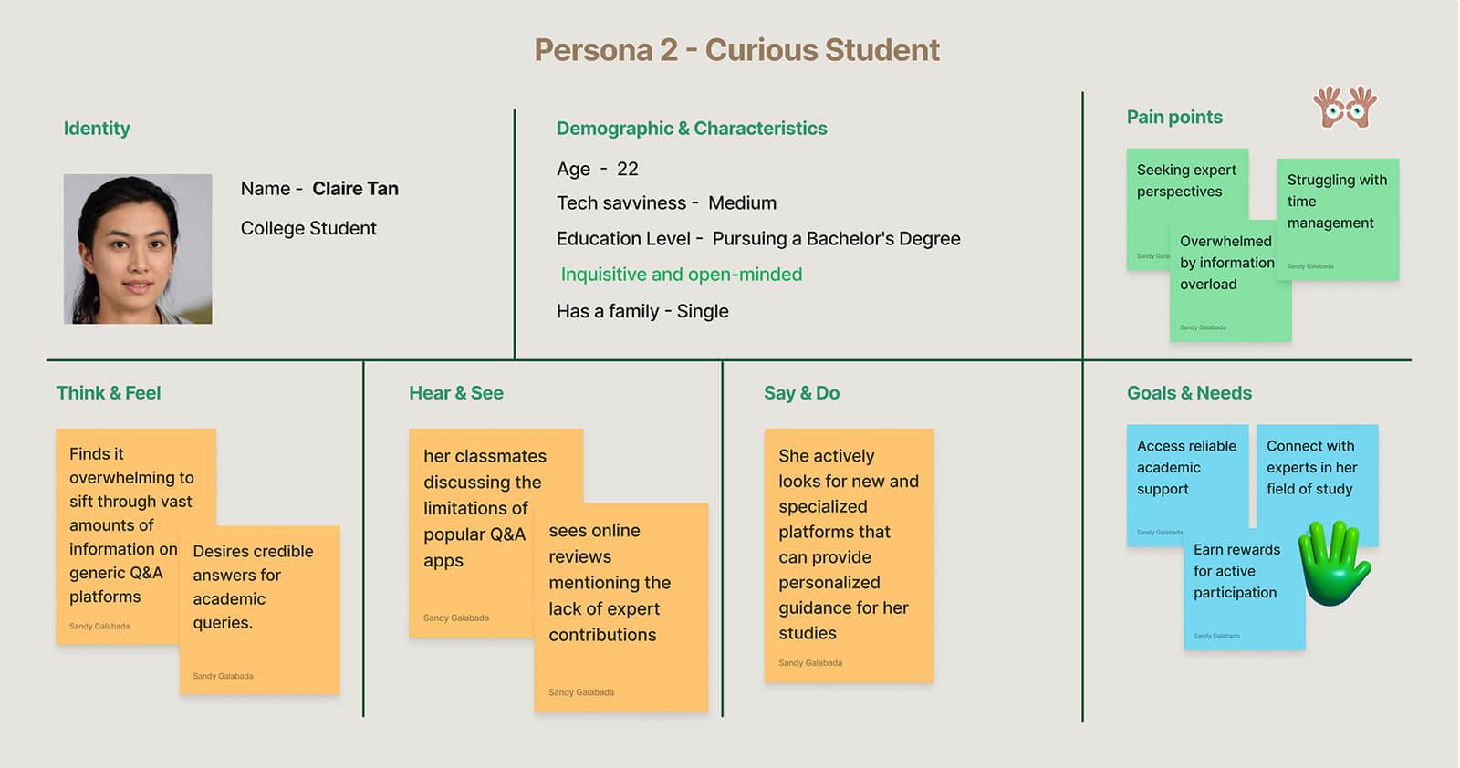
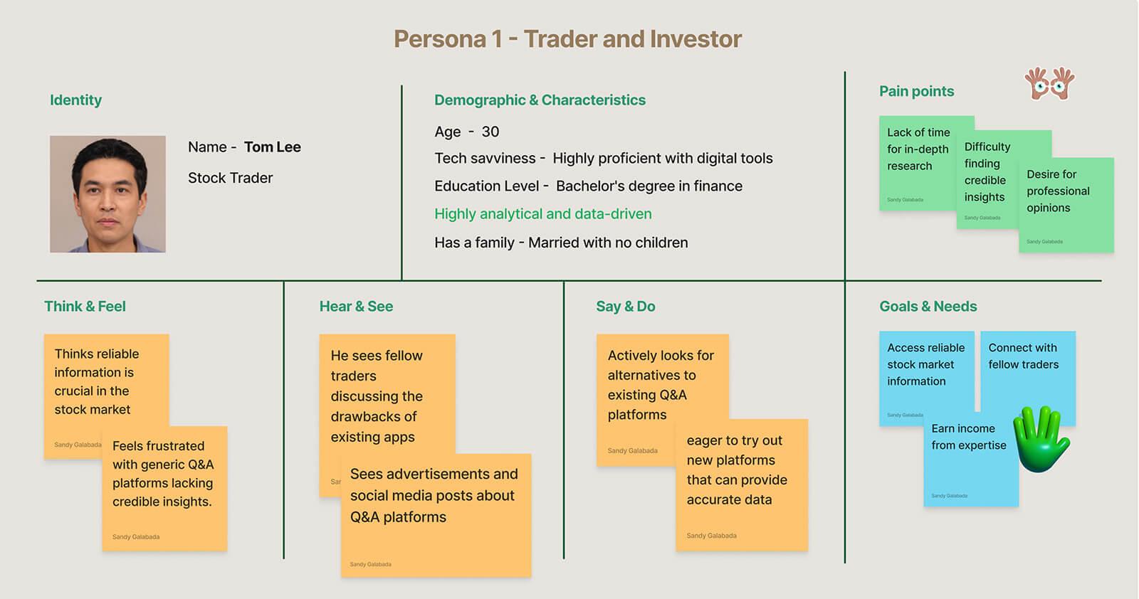
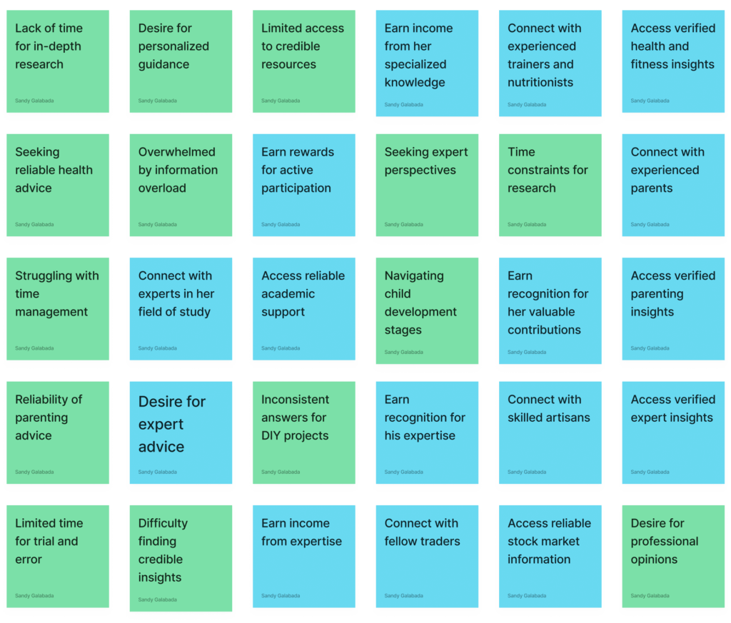
To gain a better understanding of the needs and preferences of potential Qitt users, I conducted in-depth interviews with 12 people ranging in age from 20 to 65 and from various demographics and educational backgrounds. Based on the user research, I developed detailed personas representing various user archetypes:

User personas

Key Insights from User Interviews

  1. Difficulty in finding the right information: Users faced challenges in discovering accurate and reliable answers to their questions amid the vast amount of user-generated content on existing Q&A platforms.
  2. Lack of trust in answers: Users expressed concerns about the credibility of answers provided by anonymous users, leading to doubts about the accuracy and reliability of information.
  3. Desire for professional insights: Users expressed a strong preference for receiving answers from verified professionals or experts in specific fields to ensure the accuracy and relevance of the information they receive.
  4. Frustration with distracting ads and poor visual hierarchy: Users found the presence of intrusive advertisements and a cluttered layout on existing platforms to be distracting, hindering their overall user experience.
  5. Inconsistency in answer quality: Users highlighted the need for a platform that ensures consistently accurate and high-quality answers, setting it apart from other existing Q&A apps where answers varied in reliability.

Stage 2: Define

The Define stage entailed analyzing user research data and competitor analysis to identify potential Qitt users’ pain points and goals. The following pain points and goals emerged from the research
Painpoints & goals

Stage 3: Ideate

Brainstorming Solutions

The core team, which included the CTO, mobile app developers, the marketing manager, and myself, engaged in intensive brainstorming sessions during the Ideate stage. We concentrated on developing innovative solutions to address the identified pain points while also aligning with the goals of the users. We devised the following key solutions

Key Solutions:

  1. Verified Professional Insights We proposed a feature where users can request answers from verified professionals in relevant fields. This solution addressed users’ desire for accurate and trustworthy information.
  2. Distraction-Free User Interface To tackle the issue of distracting ads and poor visual hierarchy, we designed a clean and ad-free user interface, ensuring a seamless and focused browsing experience.
  3. Expertise Tagging We introduced a tagging system for users with expertise in specific subjects, allowing them to provide answers in their respective areas of knowledge. This solution aimed to improve the consistency and quality of answers.
  4. Customization Options To address the difficulty in finding the right information, we added customization options for users to personalize their feeds and follow topics of interest, ensuring relevant content appears prominently.
  5. Rating and Feedback System We implemented a rating and feedback system for answers, enabling users to evaluate the helpfulness and accuracy of responses. This solution promoted accountability and contributed to maintaining answer quality on the platform.

Stage 4: Prototype

Prototyping Process

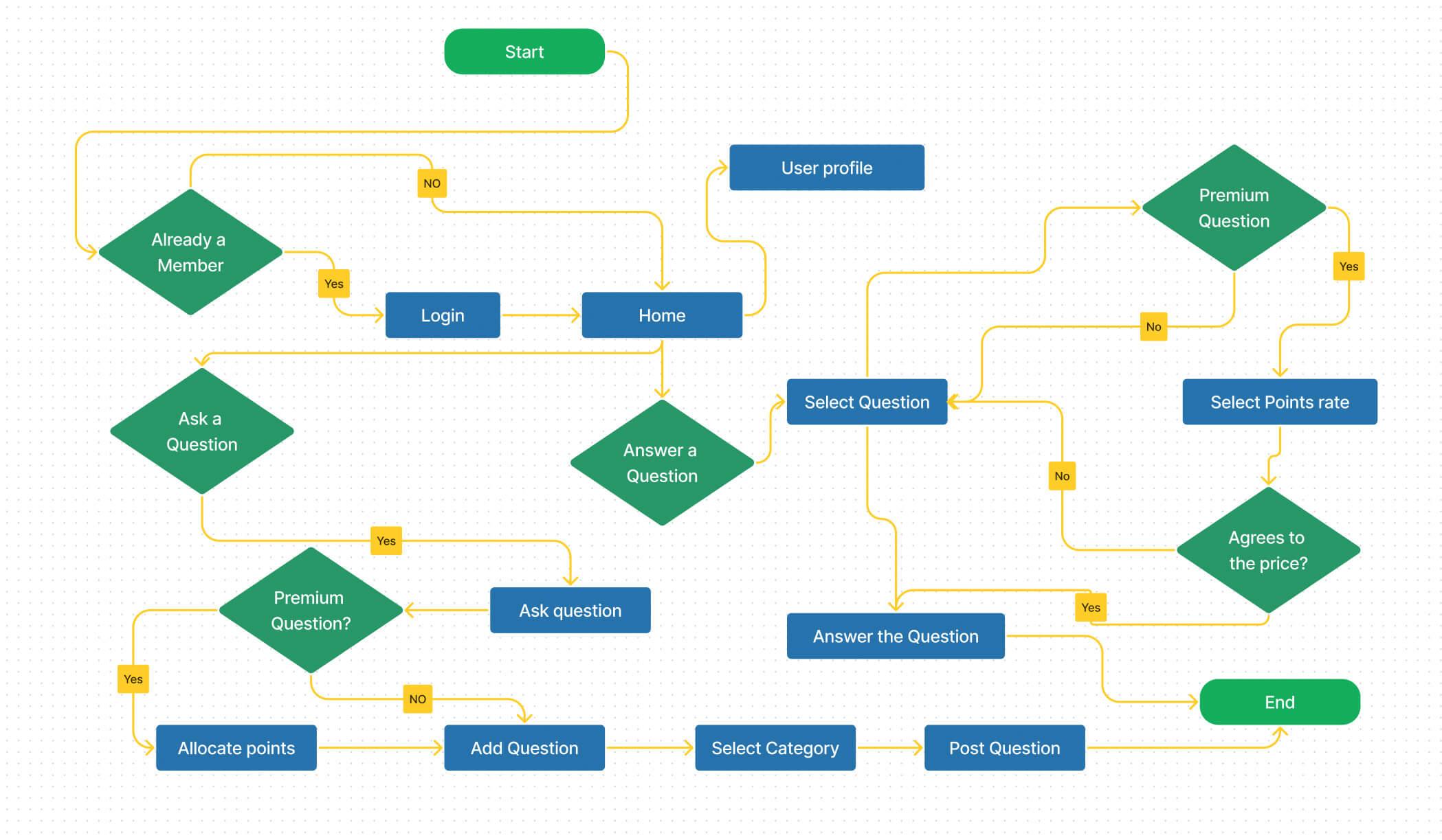
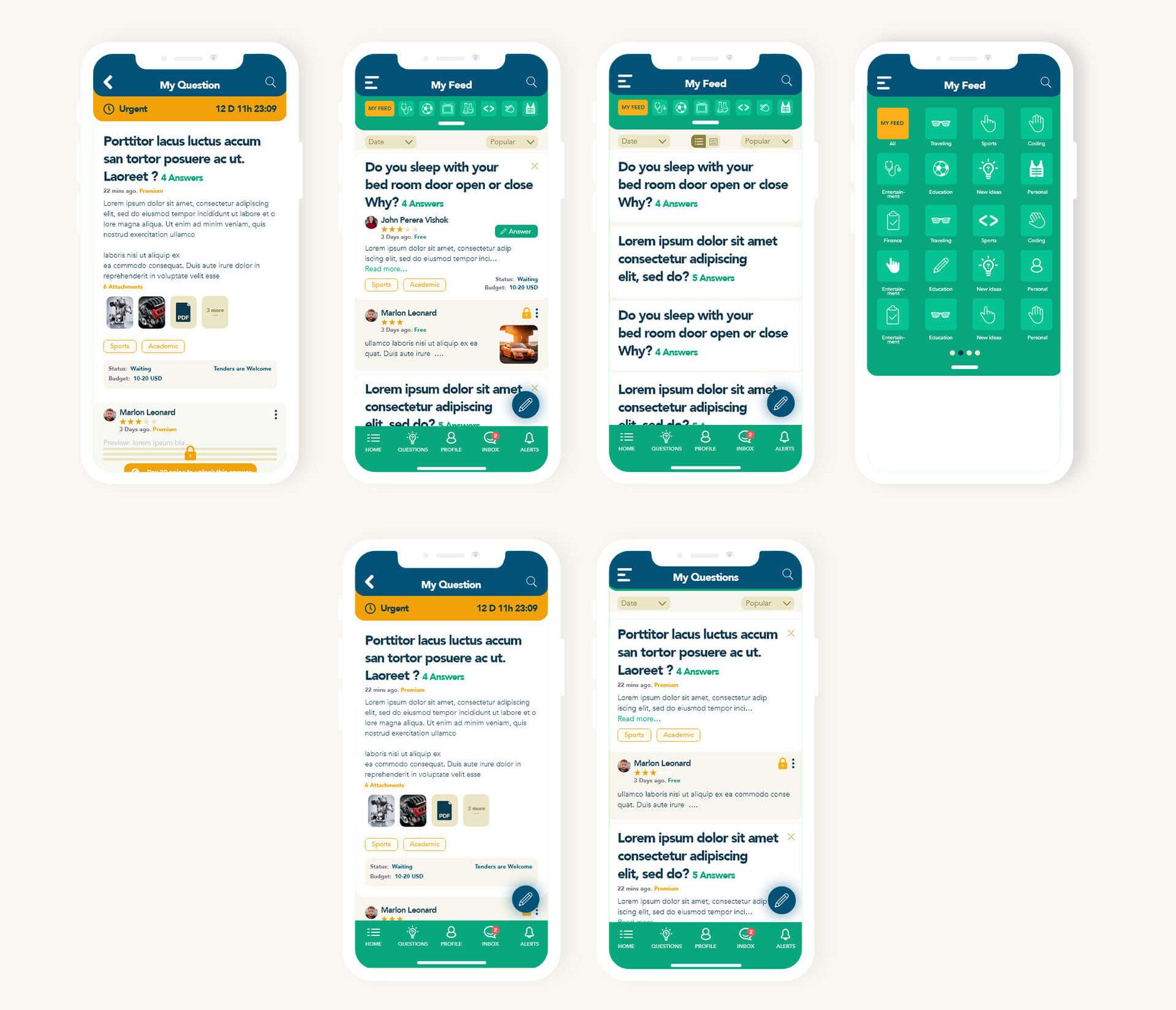
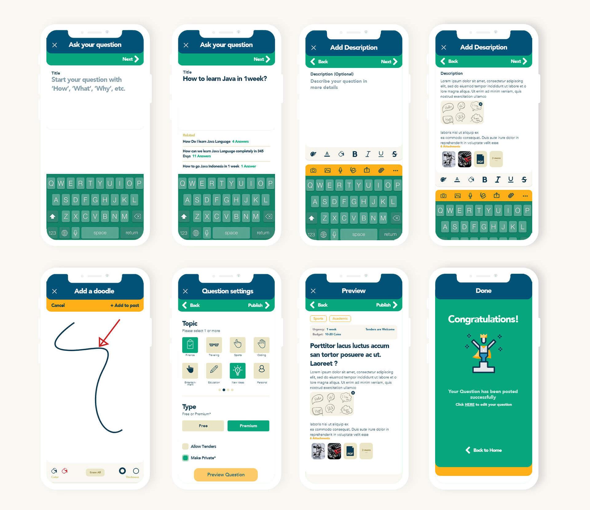
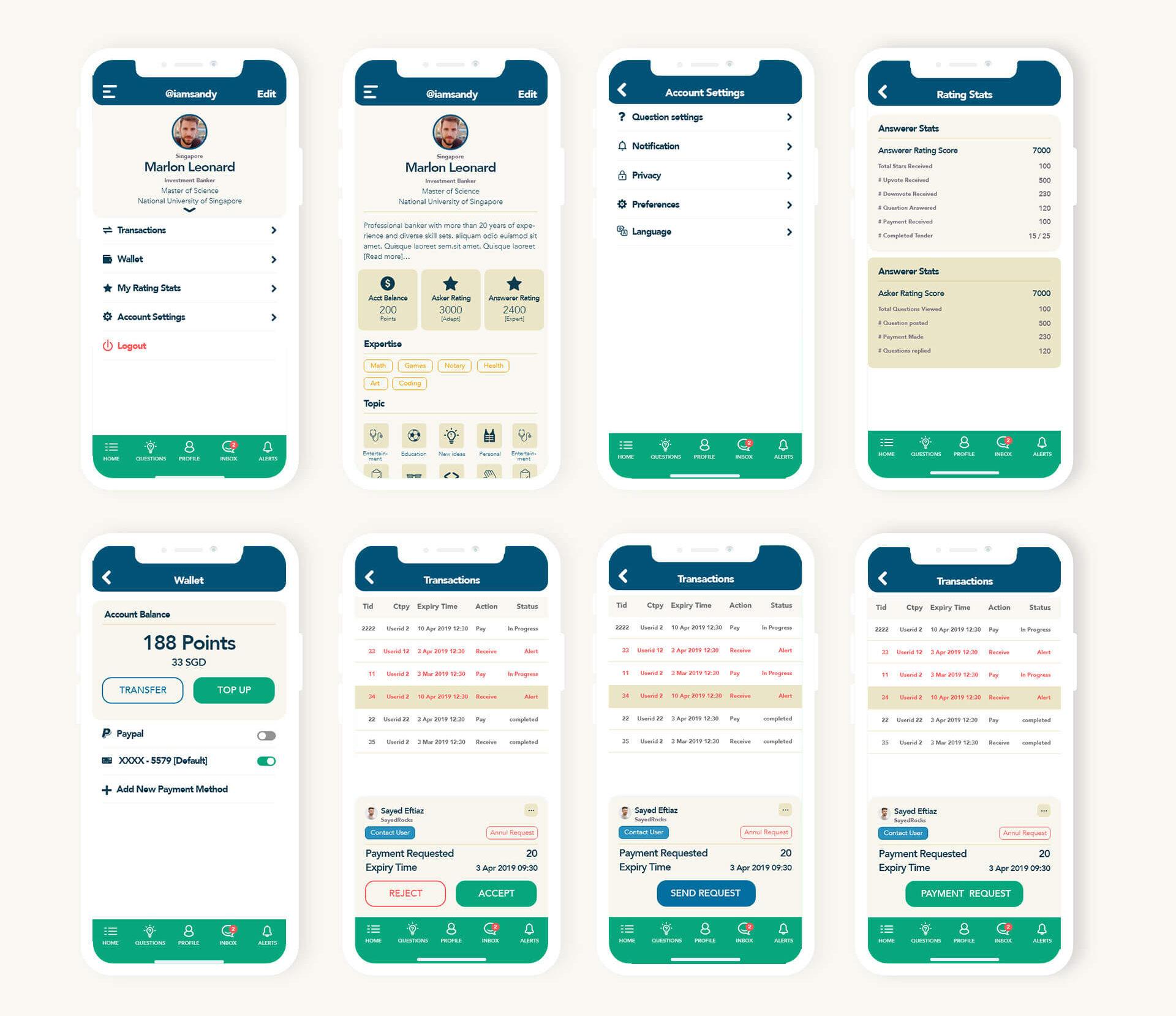
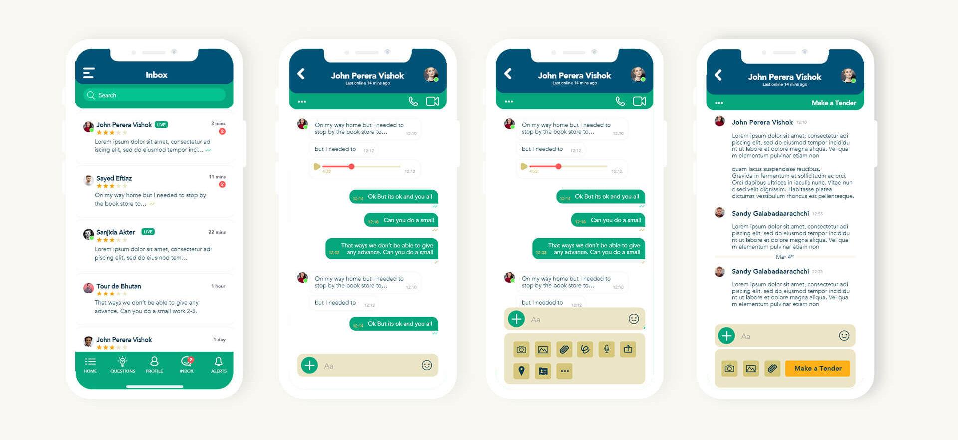
The Prototype stage entailed converting the ideas into interactive wireframes and clickable prototypes using design tools such as Figma. The goal was to create a realistic representation of the app’s functionality and user interface so that we could validate the user experience before moving on to the development phase.

Key Screens in the Prototype

App Home

A straightforward and brief walkthrough of key features for first-time users. Returning users will see a personalized home screen with trending questions and verified professional answers. The use of a green color scheme (emerald) to convey precision and trust.

Post a Question

Users can easily submit questions and attach media files such as audio, video, images, and PDF files.Users can tailor their questions for more precise answers by using the customization options.

User Profile & Transactions

A simple walkthrough displaying important user settings and transaction history. Users can view their earnings history and track their platform interactions.

Chat

An internal chat system inspired by popular messaging apps like WhatsApp, facilitating private communication between users.Additional features relevant to Qitt’s context to ensure seamless interactions.The combination of blue and green colors signifies a trustworthy and professional environment for meaningful conversations.

Stage 5: Testing

To validate the design and user experience, we conducted comprehensive testing using the interactive prototype. The testing phase involved two types of testing: usability testing and user feedback surveys.

User Feedback and Future Improvements

The prototype was rigorously tested using the USEBERRY app, which allowed us to collect user feedback and observations remotely. Participants thought the interface was easy to use, and they liked the customization options. However, some users suggested that the app include a Chinese option to appeal to a wider audience. We took this valuable feedback into consideration and intend to include the Chinese language option in version 2 of the app to improve accessibility and user engagement.

Positioning in the Market

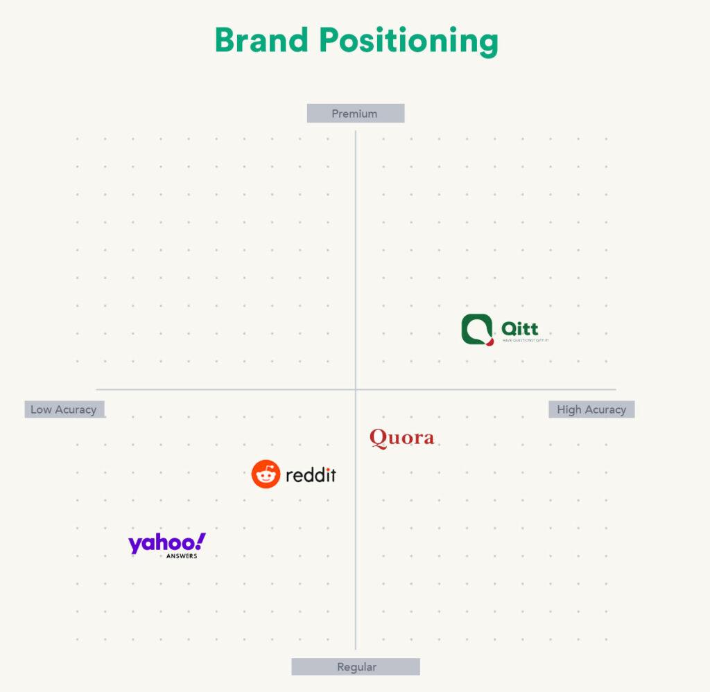
We identified the market gap and several areas for improvement in our analysis of competitor apps such as Yahoo Answers, Reddit, and Quora. The main issues that these apps faced were poor visual hierarchy, distracting ads, navigation difficulties, lack of account visibility, inconsistent icons, and answer accuracy.

We prioritized verified professional answers, streamlined navigation, and provided a clean and ad-free user interface to position Qitt as a premium and accurate Q&A platform. By addressing these issues, Qitt hoped to provide a more refined and user-friendly experience, distinguishing itself in the market as a trustworthy source of expert insights.

Logo Design and Colors

The Qitt logo was meticulously designed to reflect the app’s purpose and identity. Combining the shape of a light bulb with the letter “Q” symbolized innovation and the quest for knowledge, perfectly aligning with the app’s purpose as a Q&A platform. The primary brand color of green (emerald) reflects accuracy and instills confidence in users seeking reliable answers. The use of blue as a secondary color promotes trust and a sense of calm, both of which are necessary for having meaningful conversations. The mustard accent color adds a vibrant touch and visual interest to the app’s interface.

Furthermore, the decision to provide a light mode UI ensures comfort for users of all ages, making Qitt accessible and enjoyable to use for extended periods of time. The color palette was carefully chosen to convey professionalism, trustworthiness, and user-friendliness.

Launch and Post-Launch

Qitt’s launch in 2021 captivated users in Singapore with its verified professional insights and user-friendly interface. Post-launch analysis allowed for improvements based on user feedback. The team is now preparing for expansion to other markets and implementing a comprehensive marketing strategy to establish Qitt as a premium platform globally. With its emphasis on credible content and social connections, Qitt aims to revolutionize the Q&A experience for users worldwide.

Conclusion

Finally, the Qitt UX design process revolved around understanding user needs, brainstorming innovative solutions, and developing a visually appealing and functional app. Qitt is well-positioned to become a leading player in the competitive Q&A app market, fostering social connections and providing users with accurate and valuable insights, with an emphasis on verified professional answers and a user-friendly interface. Qitt’s future developments will be shaped by user feedback and iterative design improvements, ensuring it remains a go-to platform for credible information and engaging discussions.