

© 2025 Sandy Galabada . All rights reserved.
The content, design, and intellectual property displayed on this website, www.iamsandy.com, are the exclusive property of Sandy Galabada. Unauthorized use, reproduction, or distribution of any content or materials on this site without prior written consent is strictly prohibited. For inquiries, please contact sandy@upsense.sg
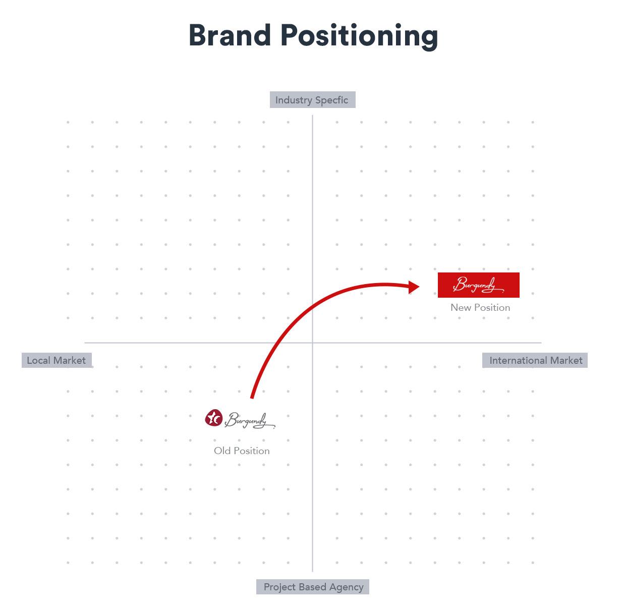
In this case study, we embarked on a transformative journey with Burgundy Consultants, a forward-thinking media agency, to reinvigorate their visual identity and web presence for a global audience. Through collaborative brainstorming and meticulous research led by their CEO, we crafted a fresh look that resonated with their heightened aspirations.
Burgundy Consultants 🇱🇰
Rebranding, Brand Positioning, Web Development
2021
Design Studio
In December 2020, I was invited by the CEO of Burgundy Consultants to participate in a discussion to re-design the agency’s new visual identity. With that, we began the re-designing process to make it fit their new internationalization. The brainstorm sessions were fruitful, as the work was amazing and always commenced with good thorough research conducted by the CEO and the teamwork had been at the highest level.
Finally, we crafted a new look for the agency that matches the new expectations.
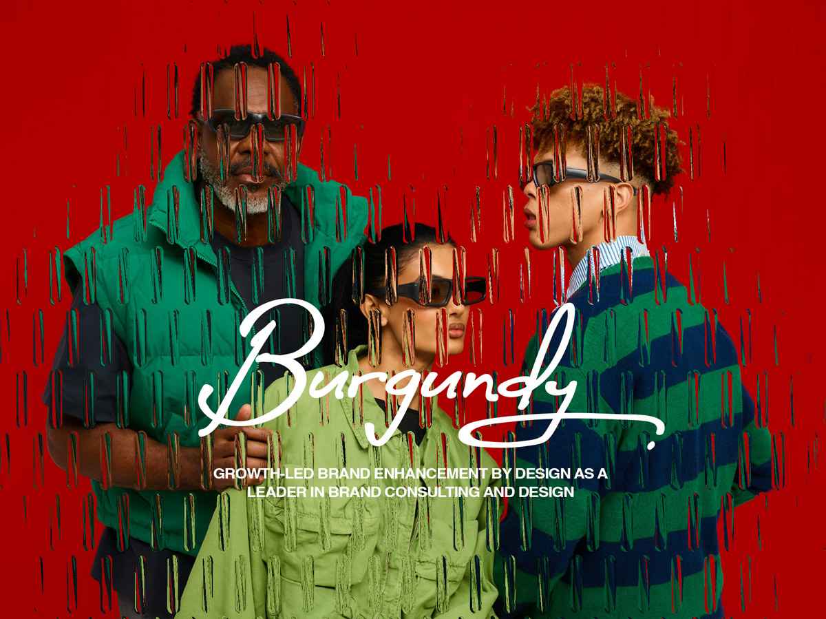
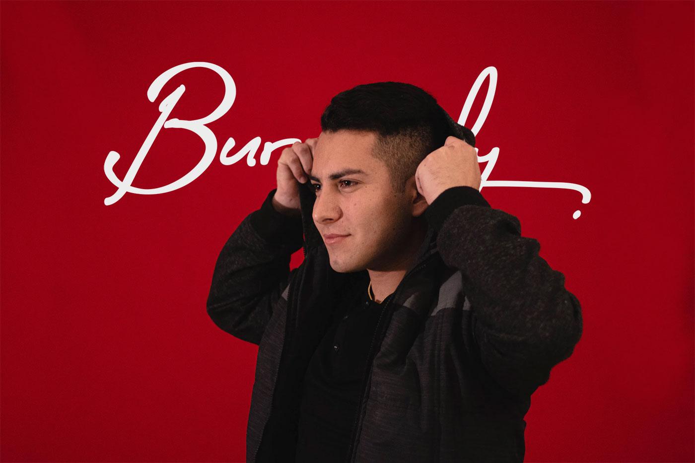
The previous logo they have been using had two main components, which are the hand-written typography and a symbol. To make it more minimal we decided to keep the typo in our main communications. The typo was the founder CEO’s handwriting. So, looking at their inception and the industrial growth, the typography had given a heritage expression, connectedness and showed how much their values meant to their clients. Since it’s a free-flowing typeface, it always had given the look of agility and moving forwardness.
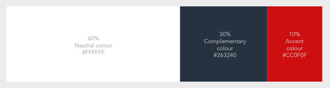
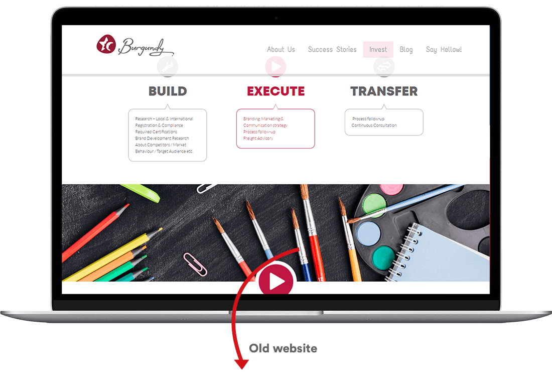
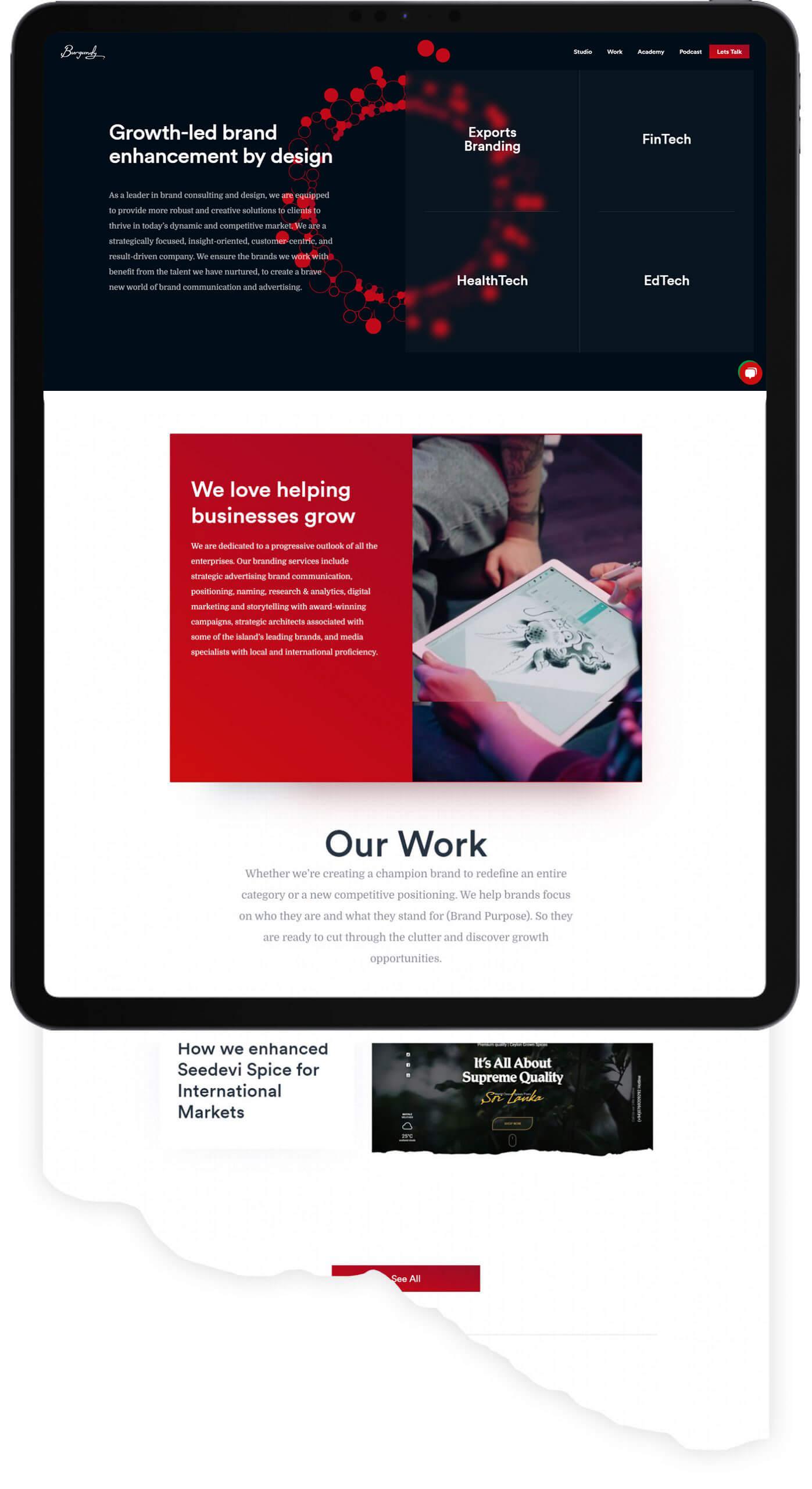
During the review sessions, we have identified a couple of issues in their current website. One of the main issues was the colour combination that made cluttered look on screen and this seemed to be widespread across the pages of the website.
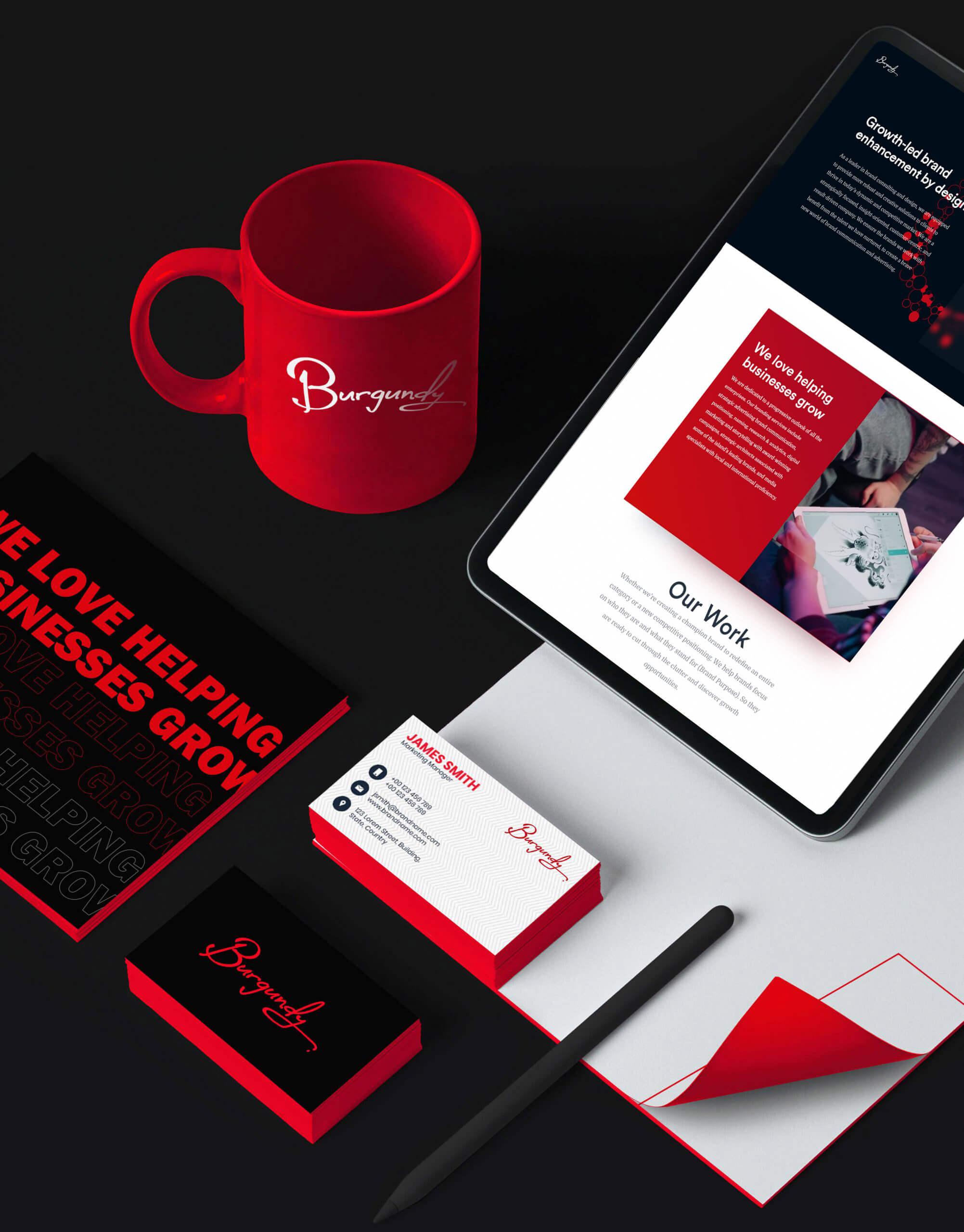
As a solution, I have followed the 60:30:10 rule which helped me to create a well-balanced colour application for Burgundy new website and it enhanced their brand identity. The idea of the rule was simply dedicating 60% of the colour palette to one colour (Usually, it’s a neutral colour), another (Complementary) colour makes up 30% of the palette, and a third colour (accent) was used for the remaining 10% of the design.
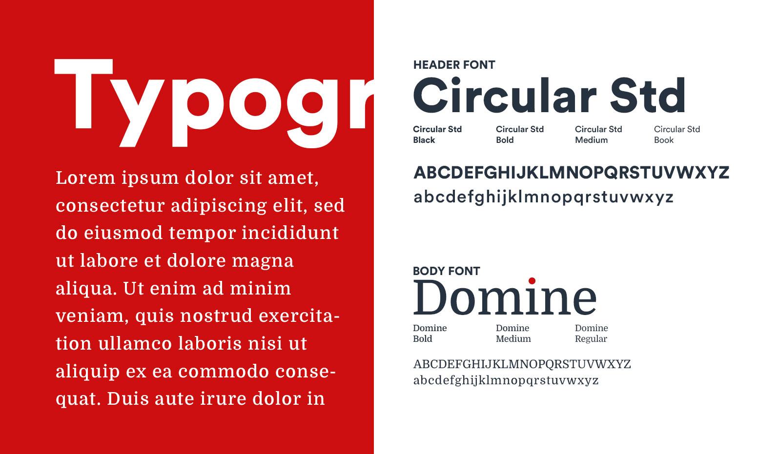
Typefaces were carefully selected to give the best expression of the brand. I have chosen two main font families to express the minimalistic yet strong and trustworthiness feeling of the agency. We have chosen a Sans serif font family and a serif font family will complement each other, for this rebranding process. For the headers, titles, and all types of huge text areas we used the Sans serif font Circular and for body text, quotes, descriptions, etc we have used the serif font named Domine. to create contrast, different weights of the same font were used.
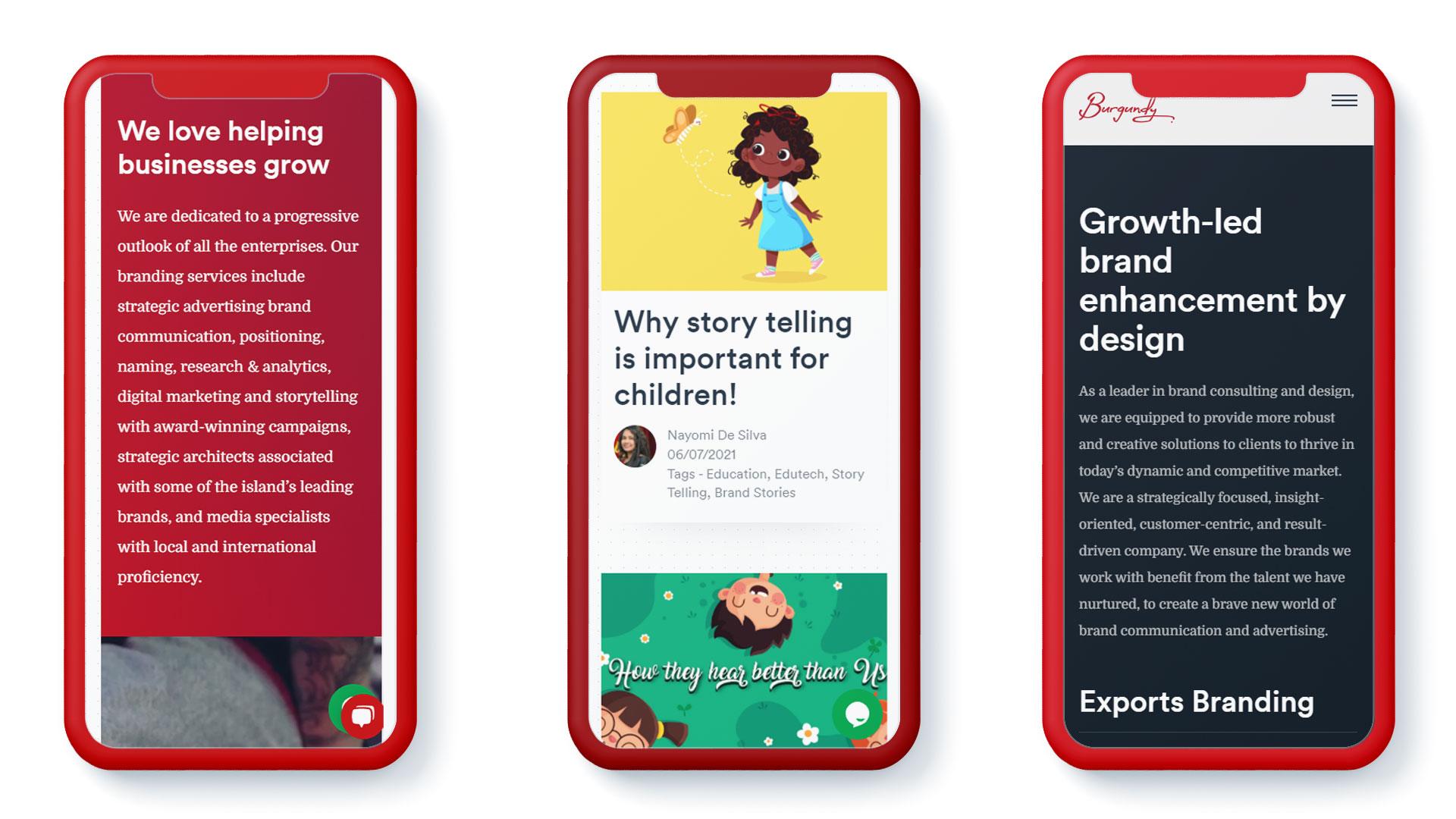
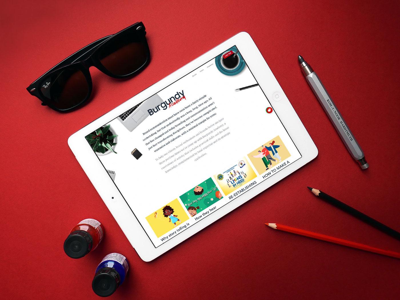
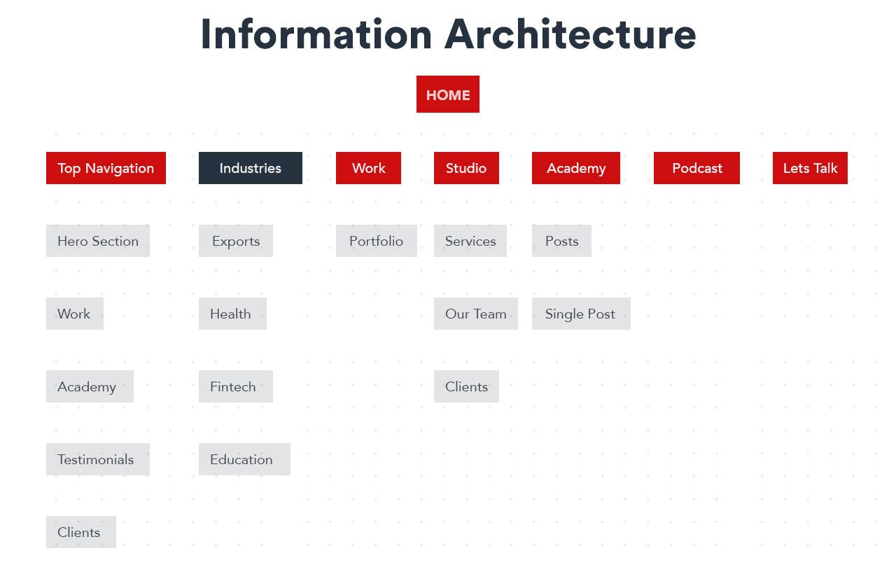
As a solution for the above issues we have designed a brand new minimalistic website for Burgundy
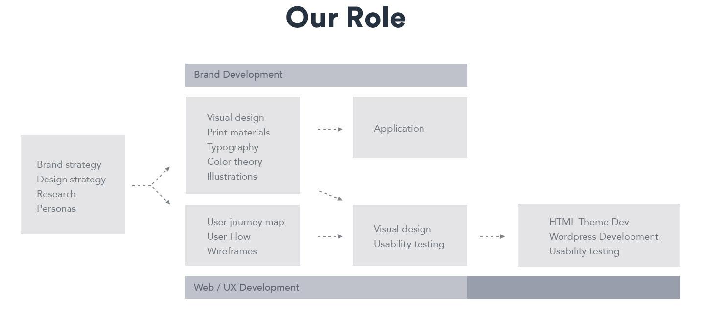
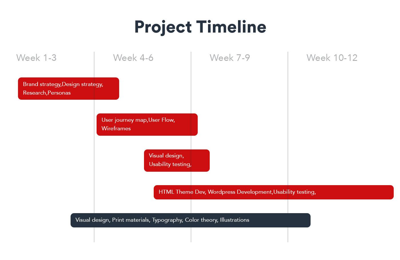
This project was executed using two main paths: brand transformation and website development. The allocated duration for this project was 12 weeks, resulting in a cohesive and modern identity that aligns with Burgundy Consultants’ vision for the future.
This project was executed using two main paths: brand transformation and website development. The allocated duration for this project was 12 weeks, resulting in a cohesive and modern identity that aligns with Burgundy Consultants’ vision for the future.
This project was executed using two main paths: brand transformation and website development. The allocated duration for this project was 12 weeks, resulting in a cohesive and modern identity that aligns with Burgundy Consultants’ vision for the future.
The main goal of the Burgundy Consultants rebranding was to reinvigorate their visual identity and web presence to better resonate with a global audience and reflect their heightened aspirations.
During the rebranding, the 60-30-10 rule was applied to create a well-balanced color application, and carefully selected typefaces were used to express the brand’s minimalistic yet strong identity.