Case Study 02
Overhaul & Facelift for Algowinner
Introduction
Industry
Fintech SAAS
Client
Algomerchant 🇸🇬
Project Type
Roles
Business Problem
Stage 1: starting the project with empathizing
The initial stage involved a detailed analysis of Algomerchant’s business objectives and the specific requirements for the UI revamp, mobile app, and landing page. Understanding the trading domain was essential to grasp the complexities of the financial market and users’ trading behaviors.
To gain insights from stakeholders, I conducted meetings with Algomerchant’s key team members, including product managers, developers, and customer support. These meetings helped align the project objectives with the organization’s vision and priorities.
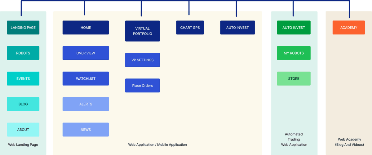
Understanding the Business Problem
Defining Project Goals
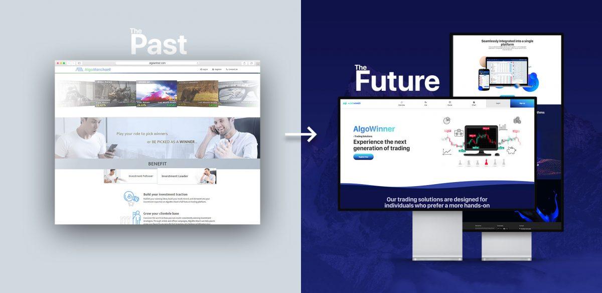
- Web Application UI Revamp: Simplify navigation for an intuitive trading experience. Enhance data visualization for real-time stock analysis. Modernize the overall look and feel for a visually appealing interface.
- Mobile App UX Research and Design: Ensure seamless navigation for on-the-go trading. Present clear and concise information catering to different user levels.Provide interactive features for efficient portfolio management.
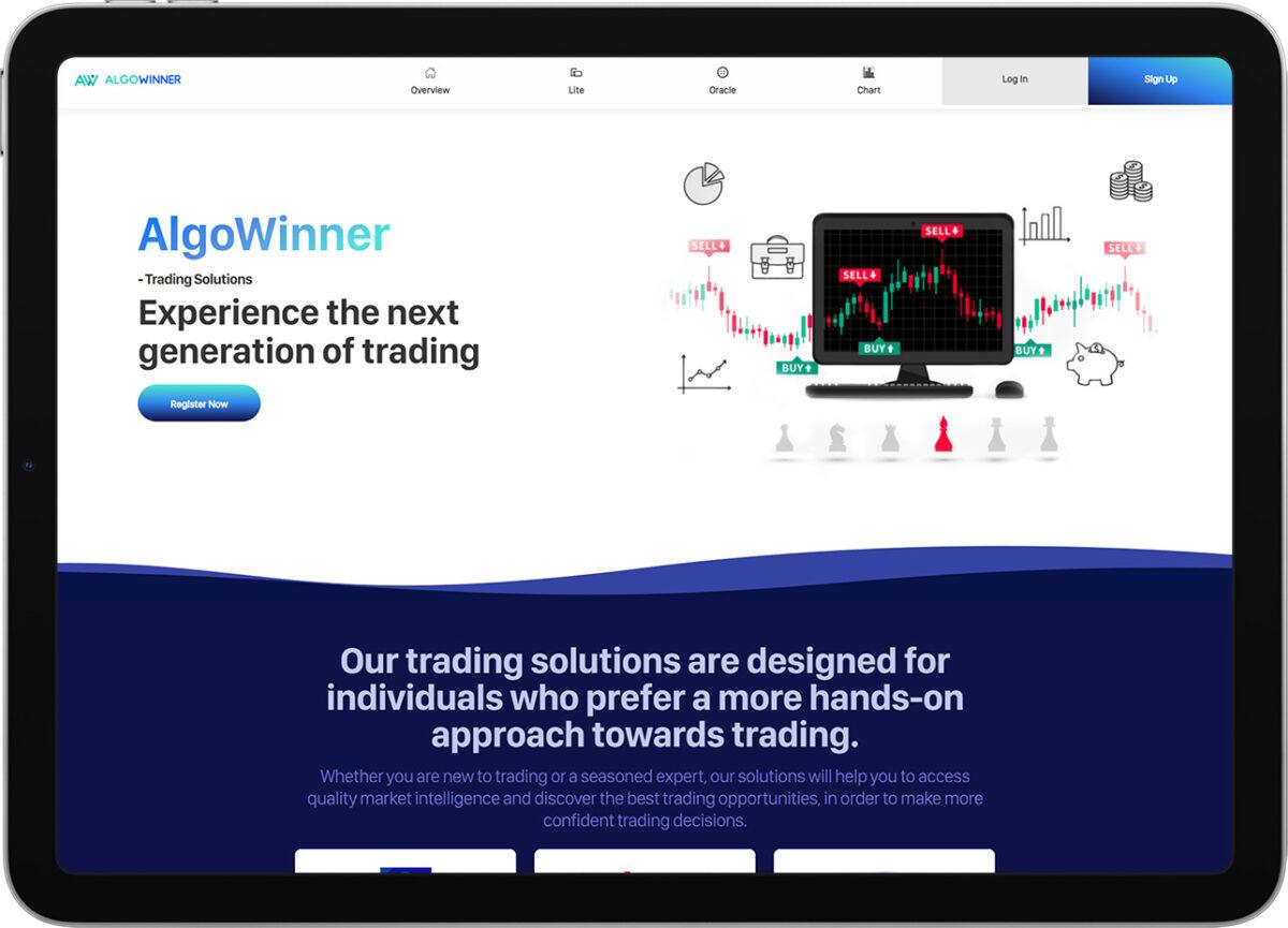
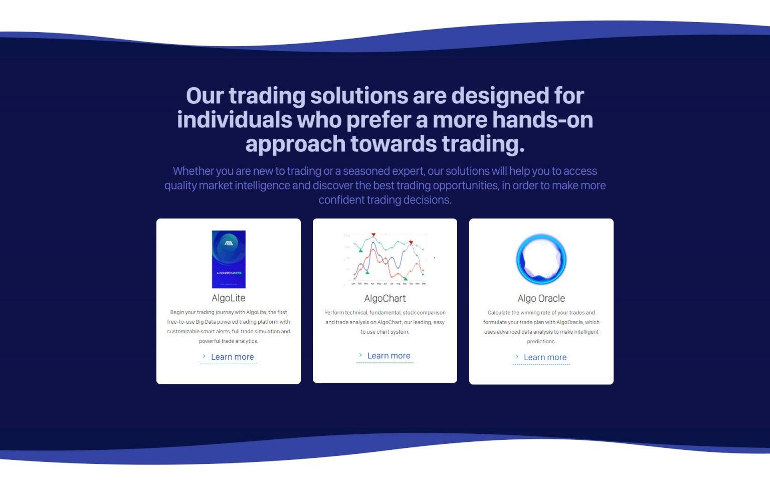
- Landing Page UX Design: Effectively communicate Algomerchant’s brand message and value proposition. Showcase products and services to cater to diverse user needs. Encourage conversions through optimized user engagement.
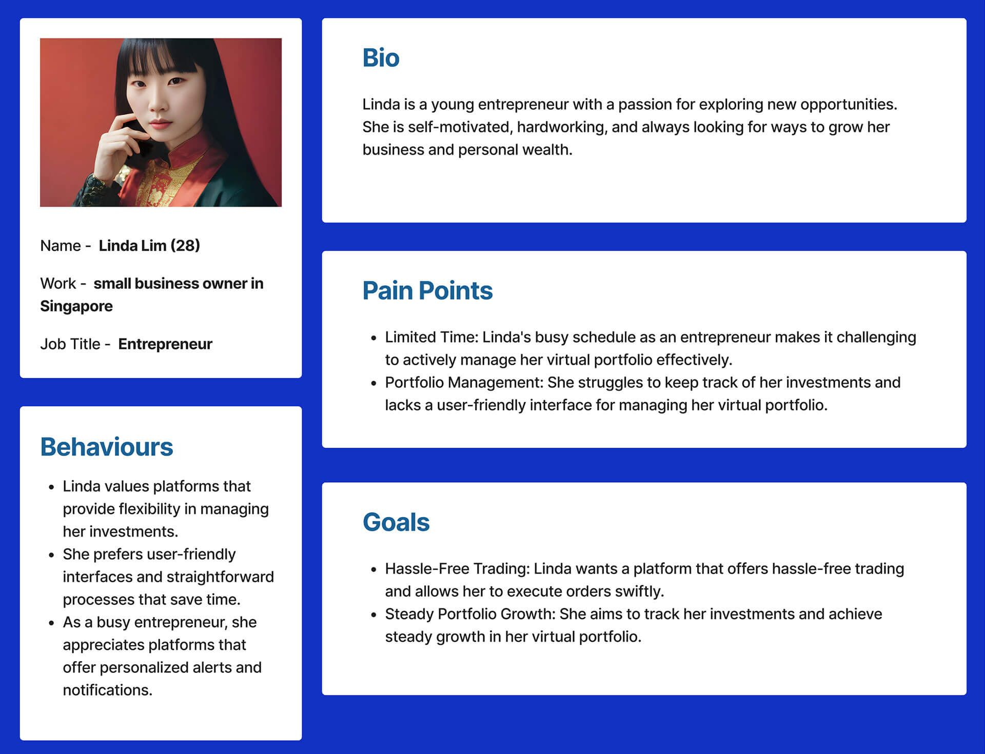
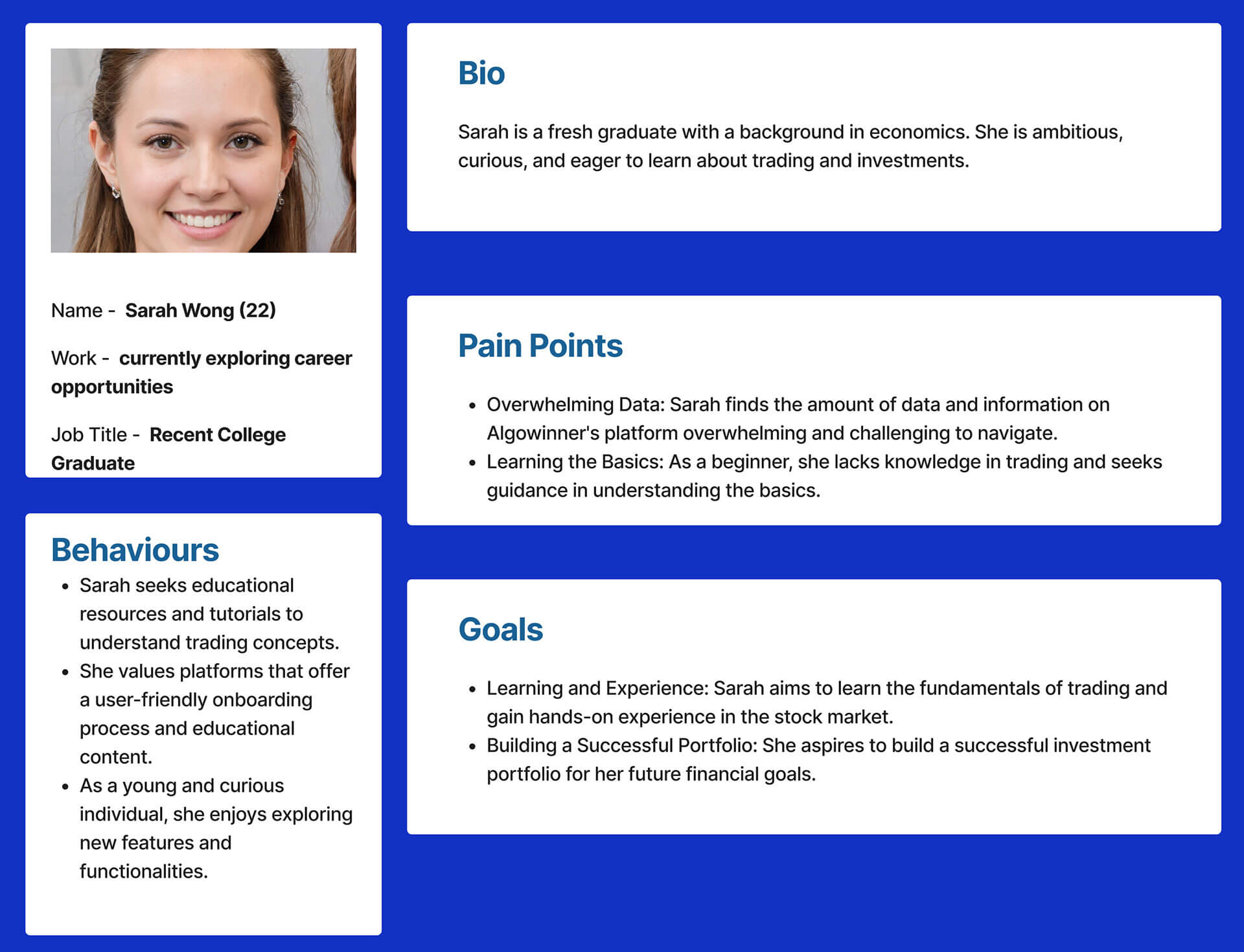
Personas Development
Stage 2: Define
UX Matrix
Next, I constructed a UX matrix that identified the key tasks, pain points, and goals of each user persona. This matrix served as a roadmap for the UX redesign, guiding us towards implementing solutions that would directly address user needs and pain points. By aligning our efforts with the UX matrix, we aimed to create an intuitive and efficient HRM solution that resonated with our target audience.
| Persona | Task | Difficulty (1-5) | Importance (1-5) | UX Related Issues | Proposed Solutions |
|---|---|---|---|---|---|
| Alex Tan | Analyzing Stock Trends | 3 | 5 | Complex Navigation and Data Visualization | Implement intuitive data visualization and simplify navigation. |
| Linda Lim | Managing Virtual Portfolio | 4 | 4 | Time Constraints and Portfolio Management | Design user-friendly portfolio management features. |
| John Lee | Mobile App Compatibility | 3 | 4 | Compatibility Issues and Outdated UI | Develop a responsive and modern UI for the mobile app. |
| Sarah Wong | Learning the Basics of Trading | 2 | 3 | Overwhelming Data and Information | Provide guided onboarding and educational resources. |
- Complex Navigation: Users find it challenging to navigate through the web application’s multiple sections, such as Home, Virtual Portfolio, Chart GPS, and Auto Invest. Simplifying the navigation flow is essential to enhance user experience.
- Outdated UI Design: The current UI design of the web application feels outdated and lacks a modern and visually appealing look and feel. A UI revamp is necessary to improve aesthetics and align with current design trends.
- Data Visualization: Users face difficulties in effectively analyzing stock trends and real-time data visualization on the web application. Improving data visualization will help traders make informed decisions efficiently.
- Mobile Compatibility: The web application’s compatibility on mobile devices needs improvement. Users desire a seamless experience while accessing the platform on-the-go through their smartphones and tablets.
- Virtual Portfolio Management: Users find it challenging to manage their virtual portfolios efficiently. Streamlining the process will enable users to track their investments effectively.
- Onboarding Process: The mobile app’s onboarding process needs to be user-friendly and straightforward to attract new users and guide them through the app’s features.
- Responsive Landing Page: The landing page needs to be responsive across various devices to provide a consistent user experience and encourage conversions.
- User Engagement: The current web application lacks interactive elements and engaging features to keep users interested and active on the platform.
- Learning Resources: Novice traders need better access to learning resources and educational content to understand the basics of trading.
- Brand Message Communication: The landing page should effectively communicate Algomerchant’s brand message and value proposition to visitors.
Stage 3: Ideate
Web Application UI Revamp
Mobile App UX Research and Design
Landing Page UX Design
Stage 4 : Prototype
Web Application UI Revamp
App home
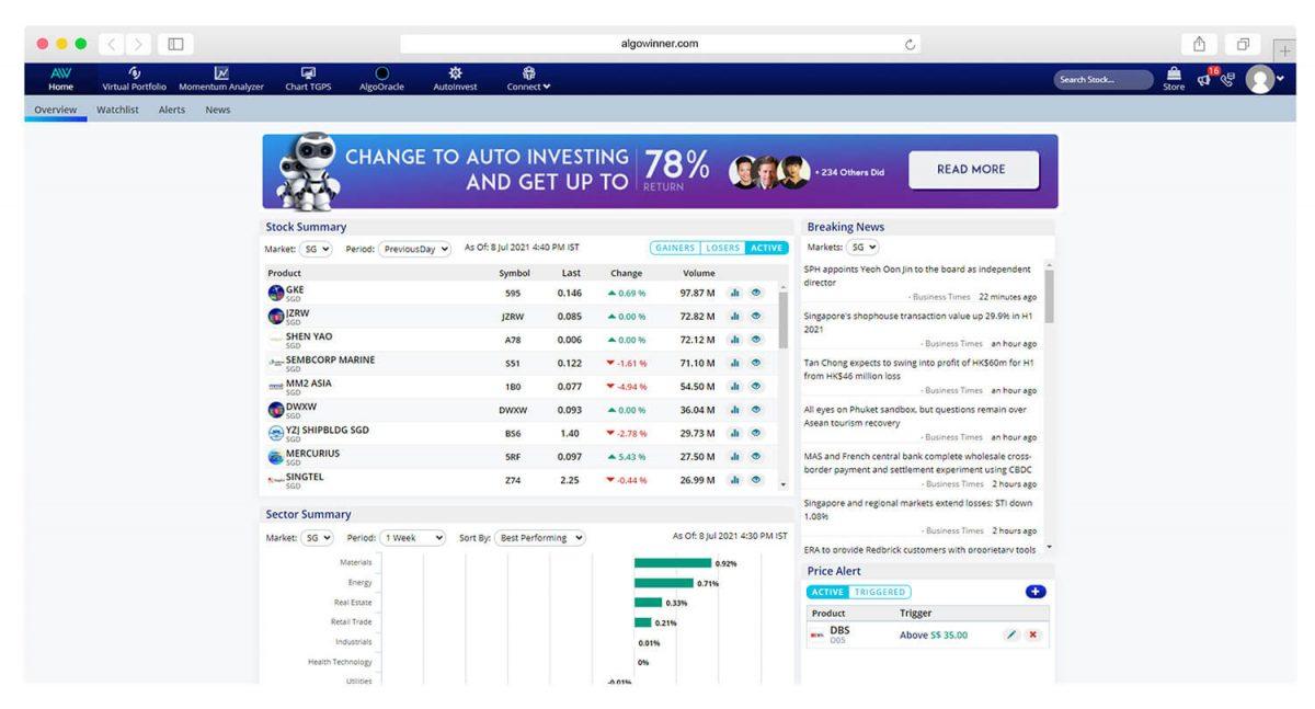
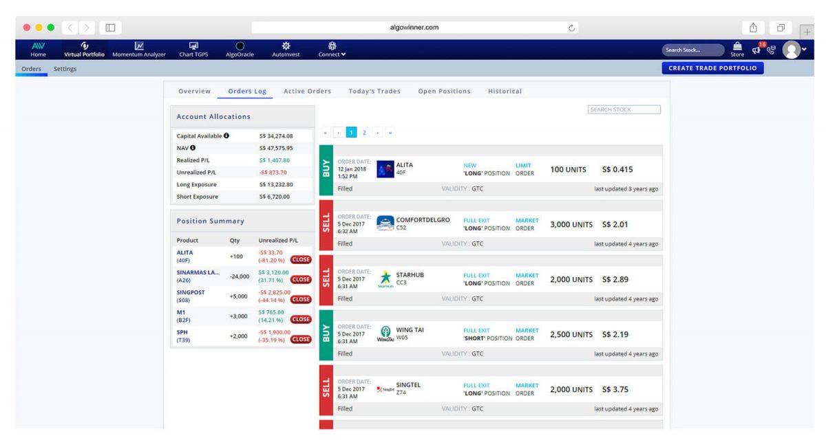
Chart GPS
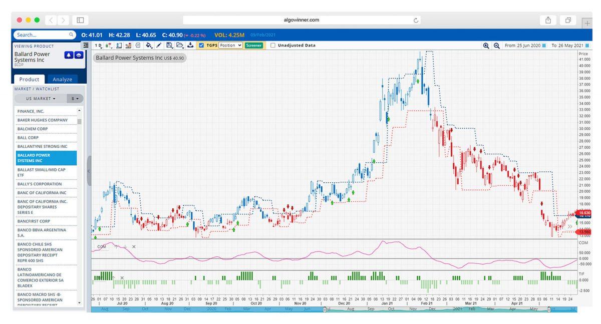
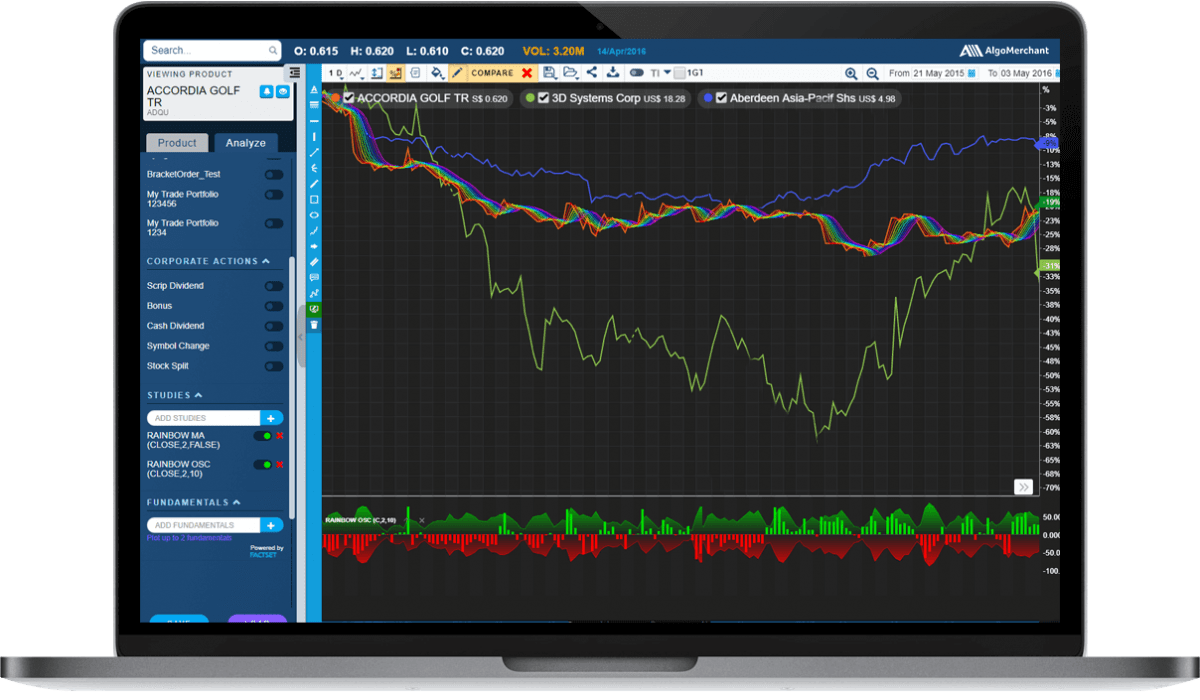
Chart GPS - Dark Theme
Mobile App UX Research and Design
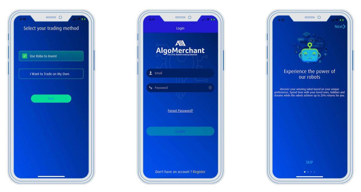
Login
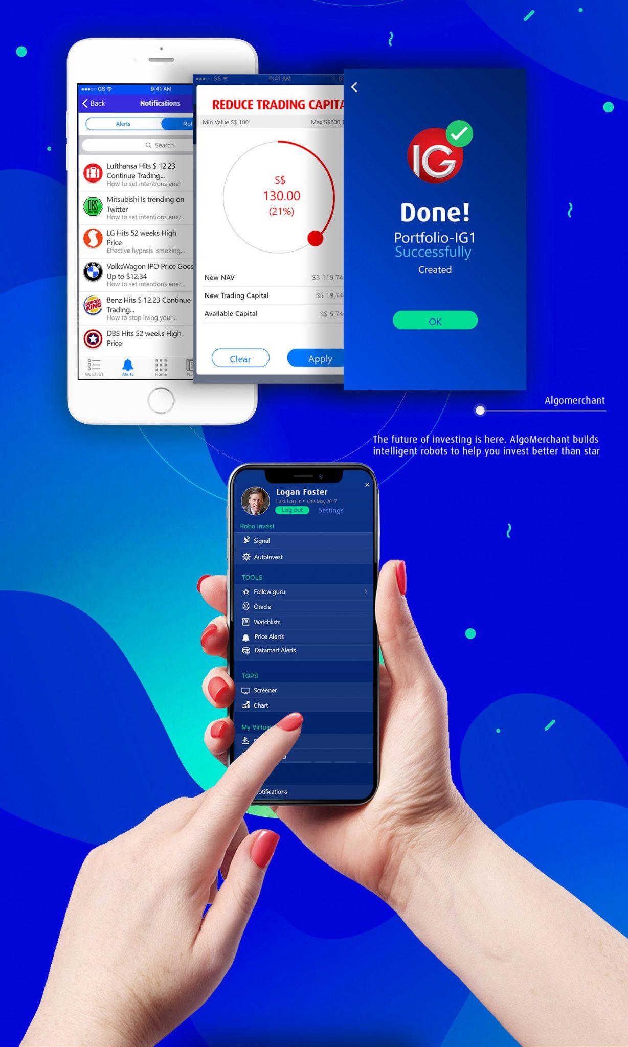
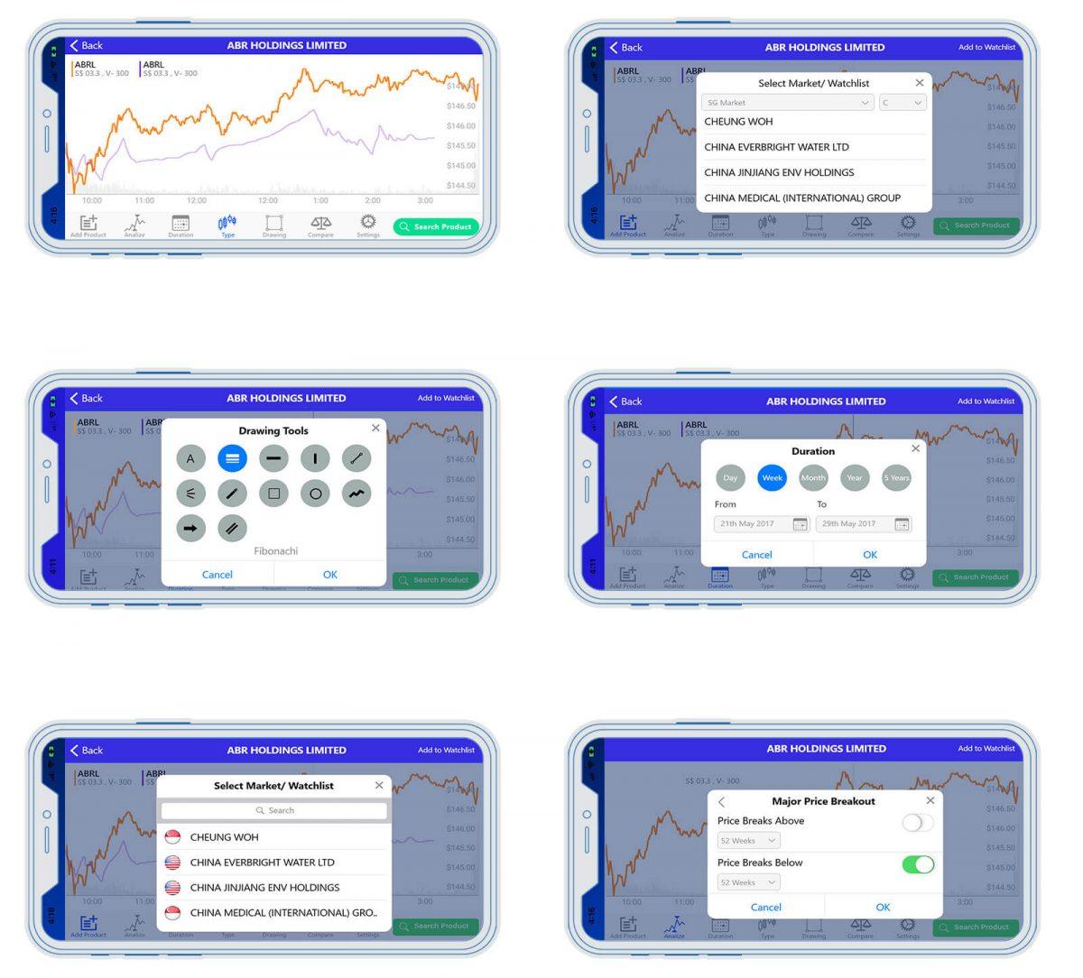
Charts on Mobile
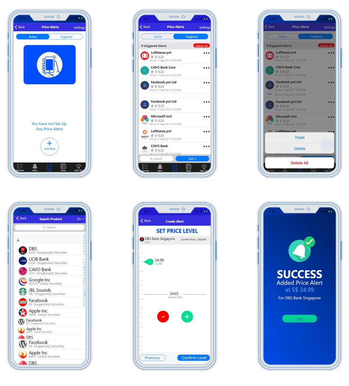
Set Up Alerts
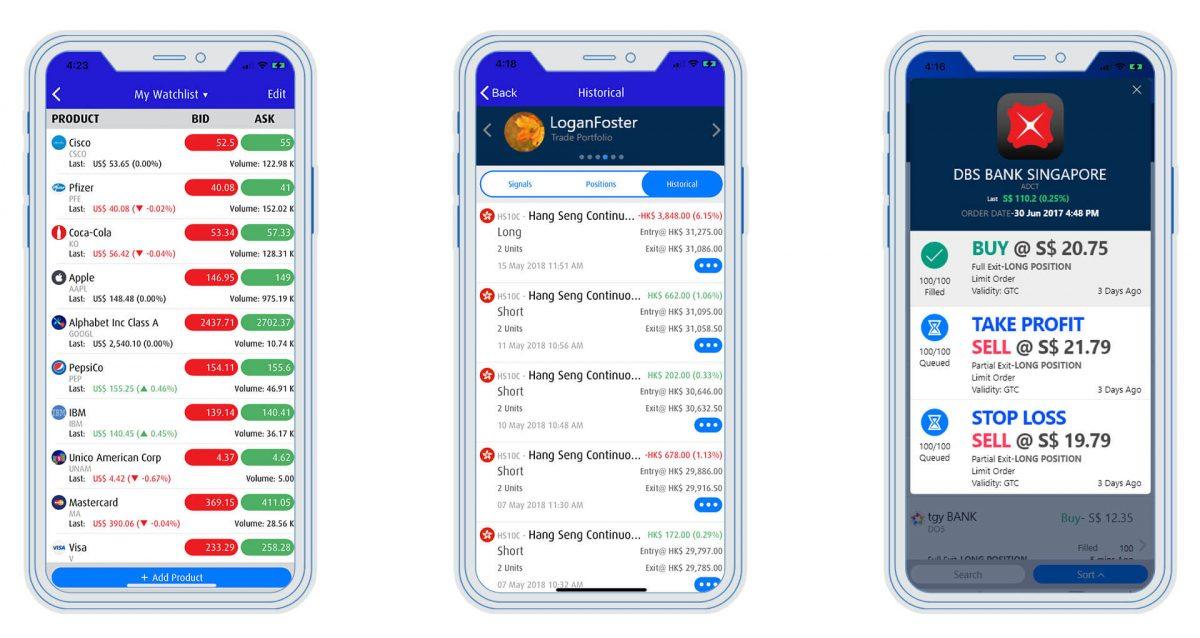
Watchlist & portfolio
Place an Order

Landing Page Design
Stage 5: Test and Implement
Web Application UI Revamp
Mobile App Launch
The mobile app was developed with the approved design and launched on app stores. Users like John Lee could now seamlessly access Algowinner on their mobile devices, enhancing their trading experience and increasing engagement.
Landing Page Launch
The landing page was integrated with Algomerchant’s website, effectively communicating the brand message to visitors like Sarah Wong. The optimized user engagement and conversion elements encouraged users to explore Algomerchant’s services further.
Results and Conclusion
The implementation of the UI revamp for the web application, the user-centric mobile app design, and the engaging landing page led to significant improvements for Algomerchant. The company witnessed a remarkable increase in registered users by 37%, daily logins by 66%, and a 55% increase in sales value after redesigning the brand and applications.
The design thinking approach, starting from empathizing with users and defining design goals to ideating creative solutions, prototyping, and testing with real users, played a pivotal role in delivering exceptional user experiences that drove business growth. Algomerchant successfully transformed its platform into a user-friendly and visually appealing online trading ecosystem, attracting both seasoned traders like Alex Tan and newcomers like Sarah Wong.
By prioritizing user needs and preferences, Algomerchant achieved significant business outcomes, establishing itself as a leading online trading platform in the competitive market. The success of the UI revamp, mobile app, and landing page demonstrated the power of design thinking in creating user-centered solutions that resonate with the target audience and contribute to business success. Through continuous user research, iterative design processes, and a focus on meeting user needs, Algomerchant continues to thrive and evolve in the dynamic world of online trading.
